Chapter 8 The state dataset
8.1 Reading in and manipulating data
The state data sets include state information in the early years around the 1970s in the USA. We pick state.abb, state.x77, and state.region to form our data files. The detailed information is listed here.
state.abb: A vector with 2-letter abbreviations for the state names.
state.x77: A matrix with 50 rows and 8 columns giving the following statistics in the respective columns.
Population: population estimate as of July 1, 1975
Income: per capita income (1974)
Illiteracy: illiteracy (1970, percent of population)
Life Exp: life expectancy in years (1969-71)
Murder: murder and non-negligent manslaughter rate per 100,000 population (1976)
HS Grad: percent high-school graduates (1970)
Frost: mean number of days with minimum temperature below freezing (1931-1960) in capital or large city
Area: land area in square miles
state.region: A factor containing the regions (Northeast, South, North Central, West) that each state belongs to.
For the convenience of analyzing the state data, let’s merge the three data sets into a single data set “sta.” It is a data frame with 10 columns and 50 rows.
tem <- data.frame(state.x77)               # Transform matrix into data frame
sta <- cbind(state.abb, tem, state.region) # Combine the three data sets
colnames(sta)[1] <- "State"                # Rename first column
colnames(sta)[10] <- "Region"              # Rename the 10th column
head(sta)
## State Population Income Illiteracy Life.Exp Murder HS.Grad Frost
## Alabama AL 3615 3624 2.1 69.05 15.1 41.3 20
## Alaska AK 365 6315 1.5 69.31 11.3 66.7 152
## Arizona AZ 2212 4530 1.8 70.55 7.8 58.1 15
## Arkansas AR 2110 3378 1.9 70.66 10.1 39.9 65
## California CA 21198 5114 1.1 71.71 10.3 62.6 20
## Colorado CO 2541 4884 0.7 72.06 6.8 63.9 166
## Area Region
## Alabama 50708 South
## Alaska 566432 West
## Arizona 113417 West
## Arkansas 51945 South
## California 156361 West
## Colorado 103766 Weststr(sta)## 'data.frame': 50 obs. of 10 variables:
## $ State : chr "AL" "AK" "AZ" "AR" ...
## $ Population: num 3615 365 2212 2110 21198 ...
## $ Income : num 3624 6315 4530 3378 5114 ...
## $ Illiteracy: num 2.1 1.5 1.8 1.9 1.1 0.7 1.1 0.9 1.3 2 ...
## $ Life.Exp : num 69 69.3 70.5 70.7 71.7 ...
## $ Murder : num 15.1 11.3 7.8 10.1 10.3 6.8 3.1 6.2 10.7 13.9 ...
## $ HS.Grad : num 41.3 66.7 58.1 39.9 62.6 63.9 56 54.6 52.6 40.6 ...
## $ Frost : num 20 152 15 65 20 166 139 103 11 60 ...
## $ Area : num 50708 566432 113417 51945 156361 ...
## $ Region : Factor w/ 4 levels "Northeast","South",..: 2 4 4 2 4 4 1 2 2 2 ...summary(sta)## State Population Income Illiteracy
## Length:50 Min. : 365 Min. :3098 Min. :0.500
## Class :character 1st Qu.: 1080 1st Qu.:3993 1st Qu.:0.625
## Mode :character Median : 2838 Median :4519 Median :0.950
## Mean : 4246 Mean :4436 Mean :1.170
## 3rd Qu.: 4968 3rd Qu.:4814 3rd Qu.:1.575
## Max. :21198 Max. :6315 Max. :2.800
## Life.Exp Murder HS.Grad Frost
## Min. :67.96 Min. : 1.400 Min. :37.80 Min. : 0.00
## 1st Qu.:70.12 1st Qu.: 4.350 1st Qu.:48.05 1st Qu.: 66.25
## Median :70.67 Median : 6.850 Median :53.25 Median :114.50
## Mean :70.88 Mean : 7.378 Mean :53.11 Mean :104.46
## 3rd Qu.:71.89 3rd Qu.:10.675 3rd Qu.:59.15 3rd Qu.:139.75
## Max. :73.60 Max. :15.100 Max. :67.30 Max. :188.00
## Area Region
## Min. : 1049 Northeast : 9
## 1st Qu.: 36985 South :16
## Median : 54277 North Central:12
## Mean : 70736 West :13
## 3rd Qu.: 81163
## Max. :5664328.2 Visualizing data
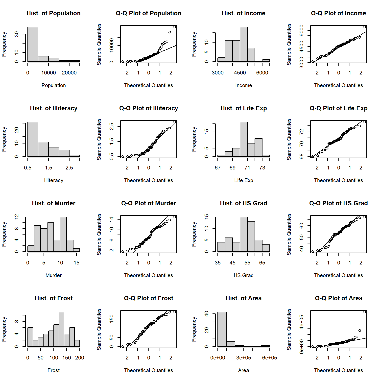
Let’s start by visualizing the distributions of numeric variables. In many cases, we want to know if our data follows a normal distribution or not so that we can decide whether some methods are suitable or not. Here are some ways that we can check the normality of a variable.
Histogram: Does the histogram approach a normal density curve? If yes, then the variable more likely follows a normal distribution.
Q-Q plot: Do the sample quantiles almost fall into a straight line? If yes, then the variable more likely follows a normal distribution.
Shapiro-Wilk test: This is a widely used normality test. The null hypothesis is that a variable follows a normal distribution. Small p-value indicates a non-normality of the variable.
a <- colnames(sta)[2:9] # Pick up all numeric columns/variables according to the names
par(mfrow = c(4, 4))    # Layout outputs in 4 rows and 4 columns
for (i in 1:length(a)){
  sub = sta[a[i]][,1]   # Extract corresponding variable a[i] in sta

  hist(sub, main = paste("Hist. of", a[i], sep = " "), xlab = a[i])
  qqnorm(sub, main = paste("Q-Q Plot of", a[i], sep = " ")) #
  qqline(sub)           # Add a QQ plot line.

   if (i == 1) {
     s.t <- shapiro.test(sub) # Normality test for population
   } else {
     s.t <- rbind(s.t, shapiro.test(sub)) # Bind a new test result to previous row
 }
}
s.t <- s.t[, 1:2]       # Take the first two columns of shapiro.test result
s.t <- cbind(a, s.t)    # Add variable name for the result
s.t
## a statistic p.value
## s.t "Population" 0.769992 1.906393e-07
## "Income" 0.9769037 0.4300105
## "Illiteracy" 0.8831491 0.0001396258
## "Life.Exp" 0.97724 0.4423285
## "Murder" 0.9534691 0.04744626
## "HS.Grad" 0.9531029 0.04581562
## "Frost" 0.9545618 0.05267472
## "Area" 0.5717872 7.591835e-11From the histograms and QQplots we can see that the distributions of Population, Illiteracy, and Area skew to the left. Income and Life.Exp are distributed close to normal. The shapiro tests show that Income, Life.Exp and Frost are normally distributed with p-values greater than 0.05, while Murder and HS.Grad are almost normally distributed with p-values very close to 0.05. There is no evidence that Population, Illiteracy, and Area having normal distribution.
In the state data, there is a categorical variable region which contains 4 observations. What is the distribution of the categorical variable? Let’s take a look at the number of observations(states) in each region and the corresponding percentage.
counts <- sort(table(sta$Region), decreasing = TRUE)  # Number of states in each region
percentages <- 100 * counts / length(sta$Region)
barplot(percentages, ylab = "Percentage", col = "lightblue")
text(x=seq(0.7, 5, 1.2), 2, paste("n=", counts))      # Add count to each bar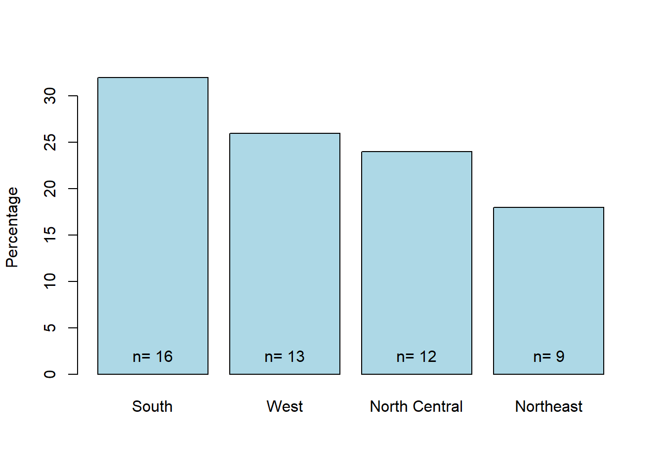
Figure 8.1: State count in each region.
The barplot tells us that we have relatively more states in the South(16) and fewer states in the Northeast(9). North Central and West have a similar number of states(12 and 13).
A lollipop plot is a hybrid of a scatter plot and a barplot. Here is the lollipop chart shows the relationship between state and population.
library(ggplot2)
ggplot(sta, aes(x = State, y = Population)) +
  geom_point(size = 3, color = "red") +
  geom_segment(aes(x = State, xend = State, y = 0, yend = Population)) +
  theme(axis.text.x = element_text(angle = 90, vjust = 0.5)) # Rotate axis label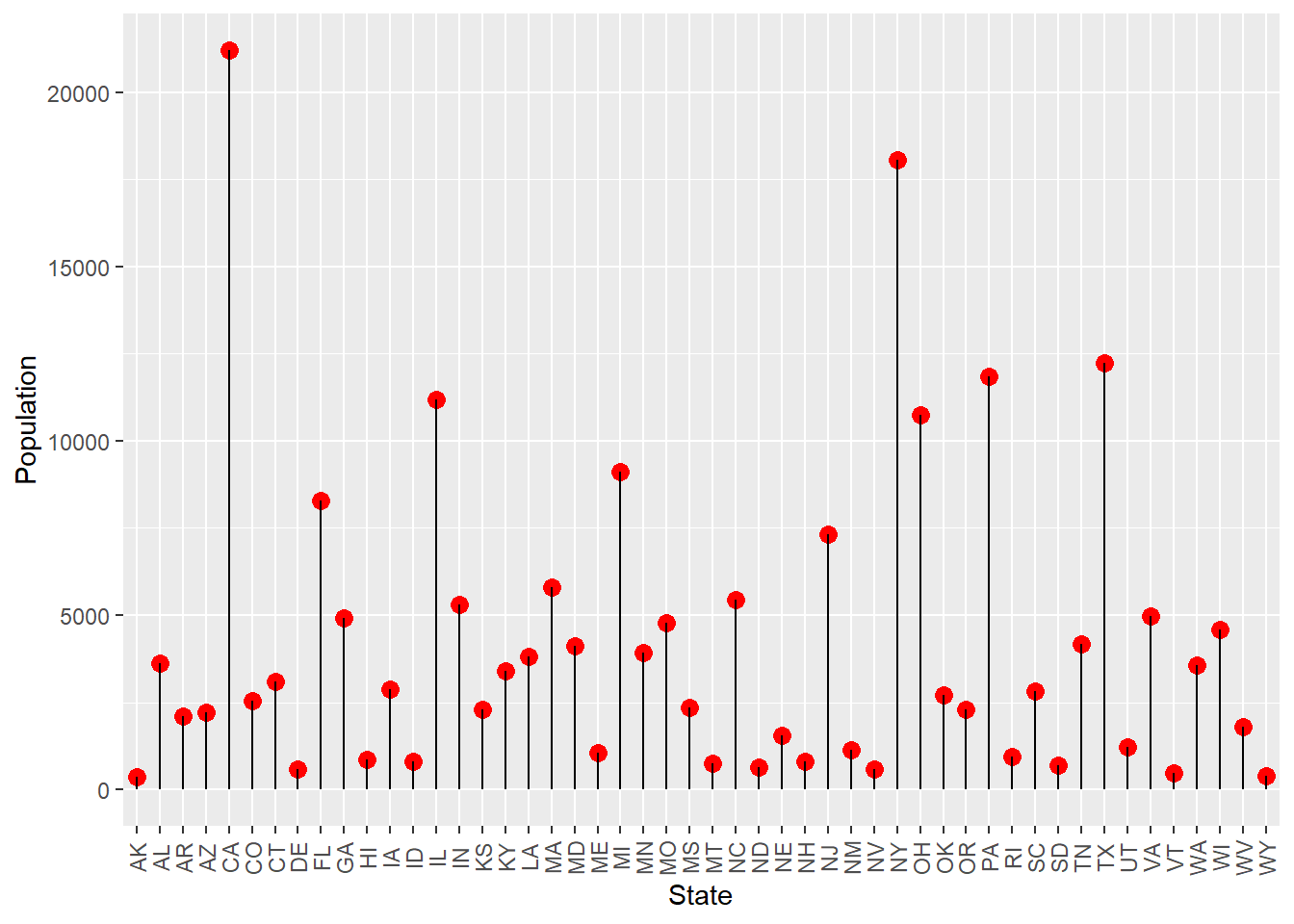
Figure 8.2: Loppipop plot of the population in each state.
From the plot we can see that even in the early days, California and New York are the top two states in population. South Dakota had little population even in the 1970s.
Other questions we may ask are: how about the murder rate distribution in the early days? Is it the same for different states and different regions? What are the main effect factors for the murder rate? Can we use a model of other factors to explain their contribution to the murder rate?
A choropleth map may give us an overall view.
library(maps)
library(ggplot2)
sta$region <- tolower(state.name)  # Lowercase states' names
states <- map_data("state")        # Extract state data
map <- merge(states, sta, by = "region", all.x = T)  # Merge states and state.x77 data
map <- map[order(map$order), ]     # Must order first
ggplot(map, aes(x = long, y = lat, group = group)) +
  geom_polygon(aes(fill = Murder)) +
  geom_path() +
  scale_fill_gradientn(colours = rev(heat.colors(10))) +
  coord_map() +
  labs(x = "Longitude", y = "Latitude") +
guides(fill = guide_legend(title = "Murder Rate")) 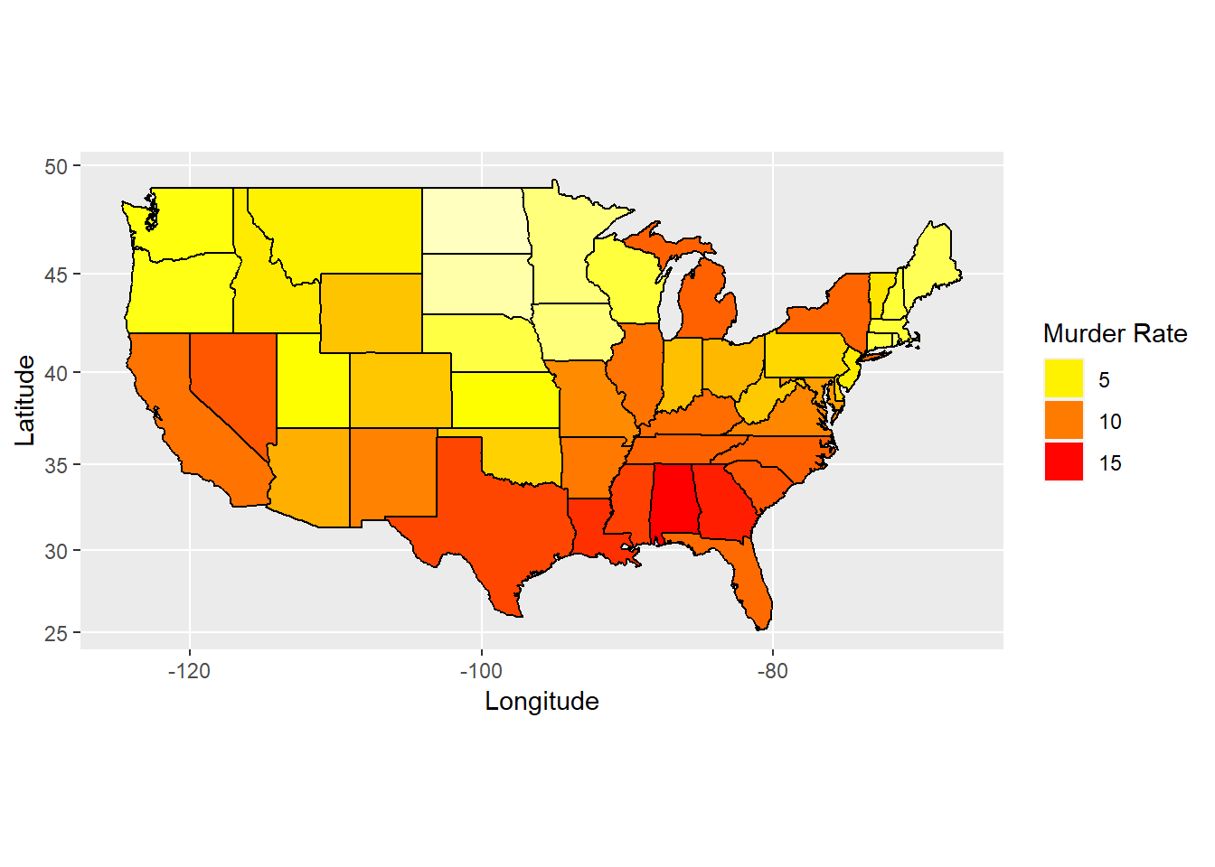
Figure 8.3: Map of murder rate distribution.
We can see from the map that the bottom and right of the map are close to red while the top middle and left are yellow. There is an area on top-right are yellow too, which means that murder rate are higher in south and east states but less in north central, northwest and northeast states.
library(ggridges)
ggplot(sta, aes(x = Murder, y = Region, fill = Region)) +
  geom_density_ridges() +
  theme_ridges() +                                 # No color on backgroud
  theme(legend.position = "none",                  # No show legend
        axis.title.x = element_text(hjust = 0.5),  # x axis title in the center
        axis.title.y = element_text(hjust = 0.5))  # y axis title in the center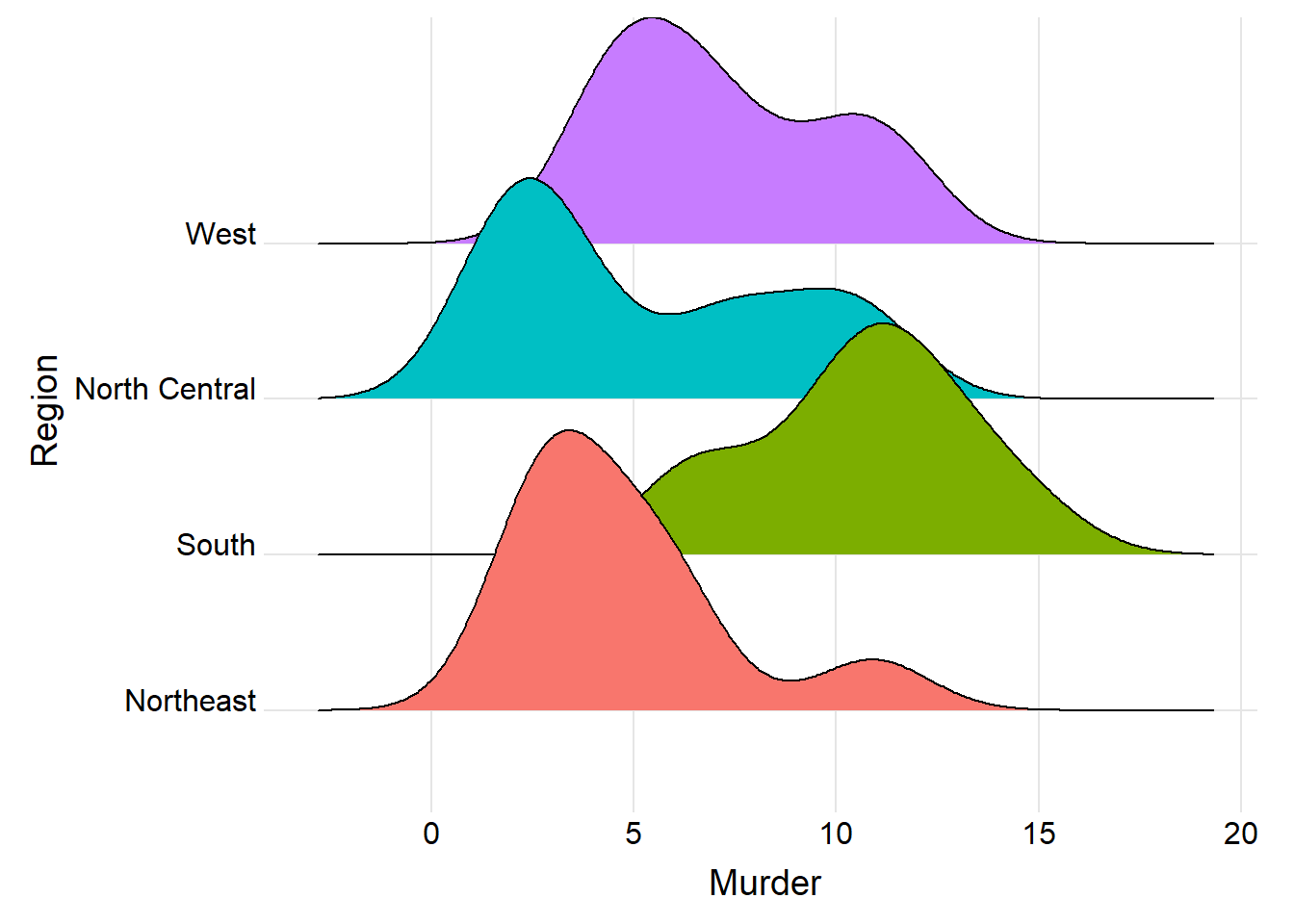
Figure 8.4: Ridgeline plot for murder rate in each region.
The ridgeline plot tells us that the murder rate skewed to the left for region west, northeast, and north central, but skewed to the right for the region south, which confirms with the map above that south has a bigger murder rate than the other regions.
Exercise 8.1
Similar to Figure 8.3, use choropleth map to obtain the Illiteracy map in state.x77 data set and give a brief interpretation. Hint: You can combine state.abb and state.x77 or use the row names of state.x77 data set directly. You can start from importing the data:
tem <- data.frame(state.x77)
sta <- cbind(state.abb, tem, state.region)
colnames(sta)[10] <- “Region”
Exercise 8.2
Similar to Figure 8.4, use ridgeline plot to explore the regional distribution of Illiteracy for state.x77 and state.region data sets and interpret your figure.
8.3 Analyzing the relationship among variables
A scatter matrix is a pair-wise scatter plot of multiple variables presented in a matrix format. To visualize the linear relationship among variables in a plot, a scatter matrix is the best choice. The range of the correlation coefficient is [-1, 1]. The coefficient -1 implies two variables are strictly negatively related, such as \(y=-x\). And coefficient 1 implies positive related, such as \(y=2x+1\). Here is the scatter matrix for our state data.
st <- sta[, 2:9] # Take numeric variables as goal matrix
library(ellipse)
library(corrplot)
corMatrix <- cor(as.matrix(st)) # Calculate correlation matrix
col <- colorRampPalette(c("red", "yellow", "blue"))  # 3 colors to represent coefficients -1 to 1.
corrplot.mixed(corMatrix, order = "AOE", lower = "number", lower.col = "black",
               number.cex = .8, upper = "ellipse",  upper.col = col(10),
               diag = "u", tl.pos = "lt", tl.col = "black") # Mix plots of "number" and "ellipse"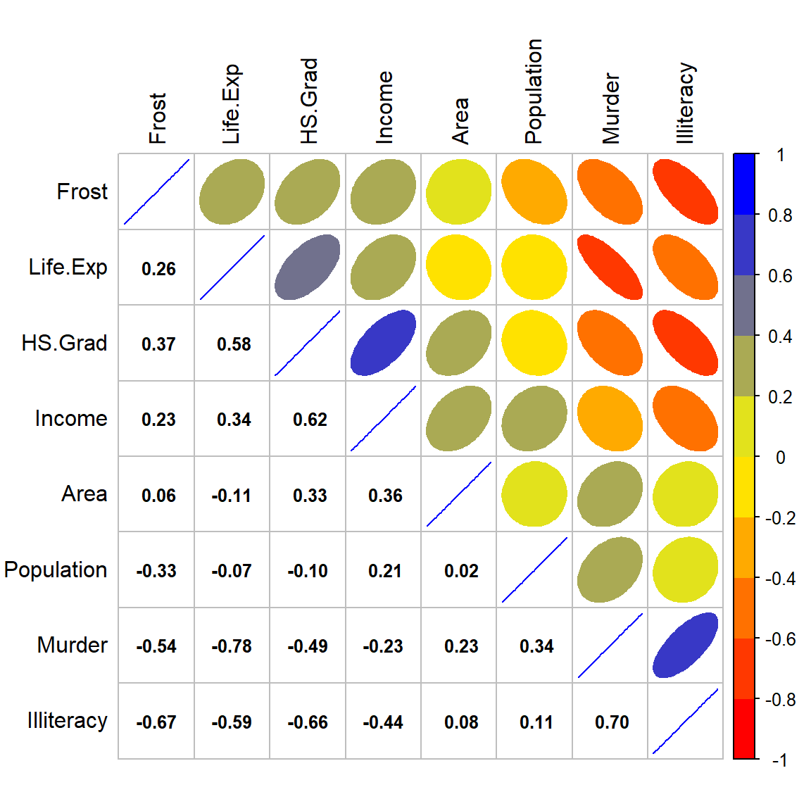
Figure 8.5: Corrplot for numeric variables.
On the top-right of the correlation figure, we can see that the red and narrow shape between Murder and Life.Exp shows a high negative correlation, the blue narrow shape between Murder and Illiteracy shows a high positive correlation, the red-orange narrow shapes between Murder and Frost, HS.Grad show a mild negative correlation, also the orange shape between Murder and Income shows small negative correlation and light-blue shapes between Murder and both Area and Population show a small positive correlation.
The pearson and spearman correlation matrix on the bottom-left gives us the r-values between each pair of the variables, which confirm the correlation shape on the top-right.
Positive correlation between Murder and Illiteracy with an r-value of 0.70 means that the lower education level the state has, the higher chance of murder rate the state will have; Negative correlations between Murder and Life.Exp, Frost, with r-values of -0.78, and -0.54 illustrate that the more occurrence of murder, the shorter life the state will expect; And the colder the weather, the lower chance the murder will occur. It’s interesting! Is it not easy for a murderer living in a cold area?
Exercise 8.3
Similar to Figure 8.5, plot a scatter matrix among 7 variables: mpg, cyl, disp, hp, drat, wt and qsec in the data set mtcars. Give a brief interpretation of the scatter matrix plot.
Now let’s see the cluster situation of these variables.
plot(hclust(as.dist(1 - cor(as.matrix(st))))) # Hierarchical clustering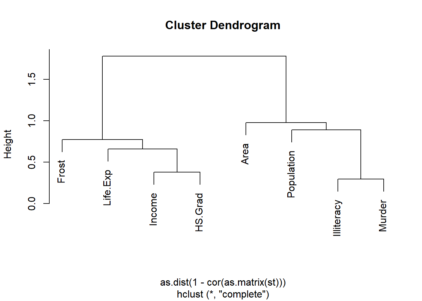
Figure 8.6: Cluster dendrogram for state numeric variables.
The cluster Dendrogram tells us that there are two clusters for these variables. Murder is mostly close to Illiteracy, and then to Population and Area. Similar situation, HS.Grad is mostly close to Income, and then to Life.Exp and Frost. Though illiteracy and HS.Grad are in the different clusters, we know for the same state, illiteracy is highly correlated with high school graduation rate; the lower the illiteracy, the higher the high school graduation rate. An r-value of -0.66 between Illiteracy and HS.Grad in the corrplot tells the same story.
Exercise 8.4
Similar to Figure 8.6, plot a cluster dendrogram of the 7 variables: mpg, cyl, disp, hp, drat, wt and qsec in the data set mtcars. Give a brief interpretation of your output.
we can use density plot to see the distribution of Illiteracy by region.
ggplot(sta, aes(x = Illiteracy, fill = Region)) + geom_density(alpha = 0.3)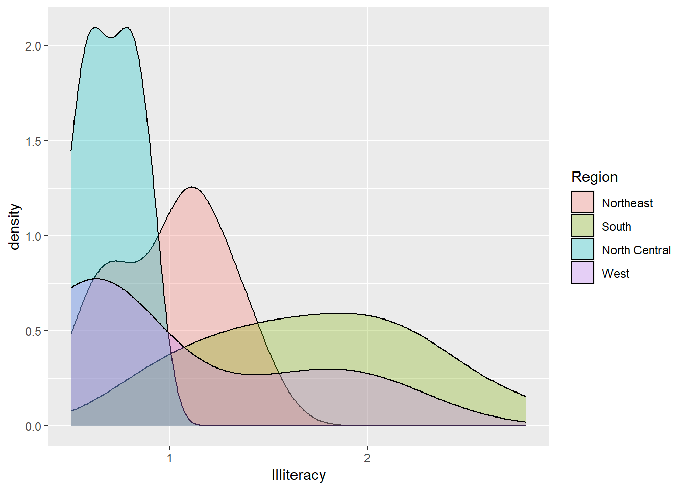
Figure 8.7: Illiteracy distribution by region.
We can see that the north-central region has narrow density distribution with most Illiteracy less than 1 percent of the population. While the south region has an open and bell-shaped distribution with illiteracy covered from 0.5 to 3. Though region west has a spread out distribution too, it’s left-skewed; There are lots of west states with illiteracy of less than 1% of its population. Most northeast region states have illiteracy less than 1.5% of their population.
Exercise 8.5
Similar to Figure 8.7, use density plot to see the distribution of mpg by cyl in the data set mtcars.
Because of the relationship of Murder with both Population and Area, We add one more column of Pop.Density for the population per square miles of area to see the correlation between Murder and this density.
sta$Pop.Density <- sta$Population/sta$Area
boxplot(sta$Pop.Density ~ sta$Region, xlab = "Region", ylab = "Population Density")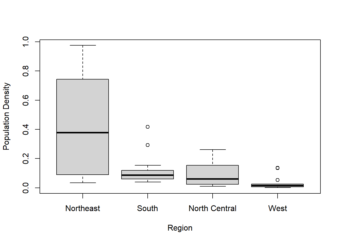
Figure 8.8: Box plot of population density by region.
model <- aov(sta$Pop.Density ~ sta$Region, sta)
summary(model)
## Df Sum Sq Mean Sq F value Pr(>F)
## sta$Region 3 1.051 0.3502 12 6.3e-06 ***
## Residuals 46 1.343 0.0292
## ---
## Signif. codes: 0 '***' 0.001 '**' 0.01 '*' 0.05 '.' 0.1 ' ' 1The box plot shows that the mean Pop.Density of Northeast is much more than the other regions, while West has the lowest mean Pop.Density. ANOVA test with a p-value of 6.3e-06 also give us the evidence to reject the null hypothesis that the mean Pop.Densities are the same for different regions, which means at least one of the regional mean population densities is different from the others.
Here is the scatterplot for Illiteracy and Murder with Population per area.
ggplot(sta, aes(x = Illiteracy, y = Murder)) +
  geom_point(aes(size = Pop.Density, color = Region)) +
  geom_smooth(method = 'lm',formula = y ~ x)  # Add regression line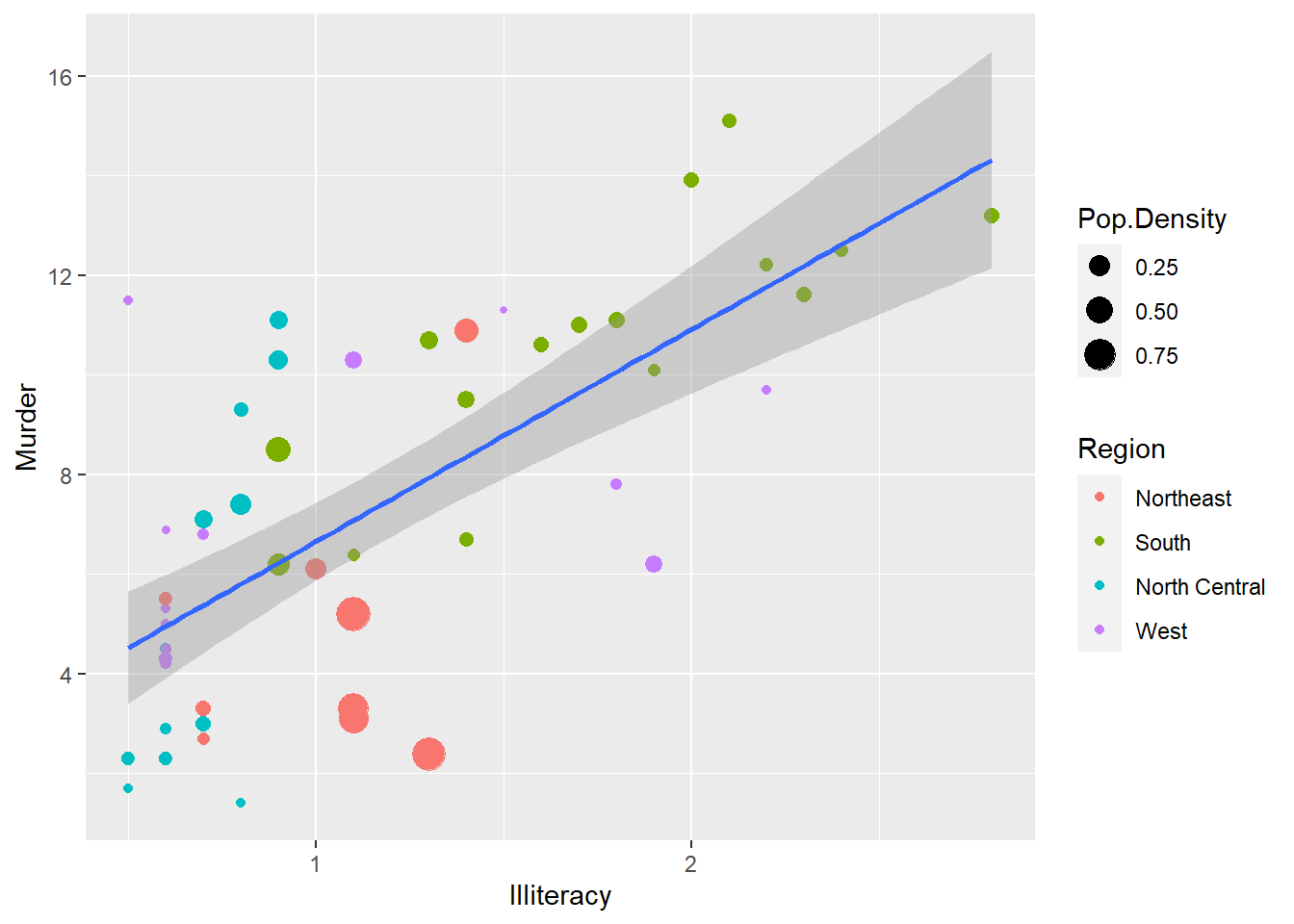
Figure 8.9: Scatterplot for illiteracy and murder sized by population density and colored by region.
The plot shows that murder and illiteracy are positively correlated. All states in the other three regions have murder rates of less than 12 per 100,000 population except some of the south states(green). All north-central states(blue) have illiteracy less than 1, all northeast states(red) have less than 1.5 of illiteracy. The illiteracy of west(purple) and south states have much bigger variance, some western states have illiteracy less than 0.5, while some south states have illiteracy more than 2.75. Many Northeast states have big population densities but middle illiteracy rates compared with the states in the other three regions.
Because of the high correlation of murder and Life.Exp, we will take a look at the distribution of Life.Exp.
ggplot(sta, aes(x = Region, y = Life.Exp, fill = Region)) +
  geom_violin(trim = FALSE) +
  geom_boxplot(width = 0.1)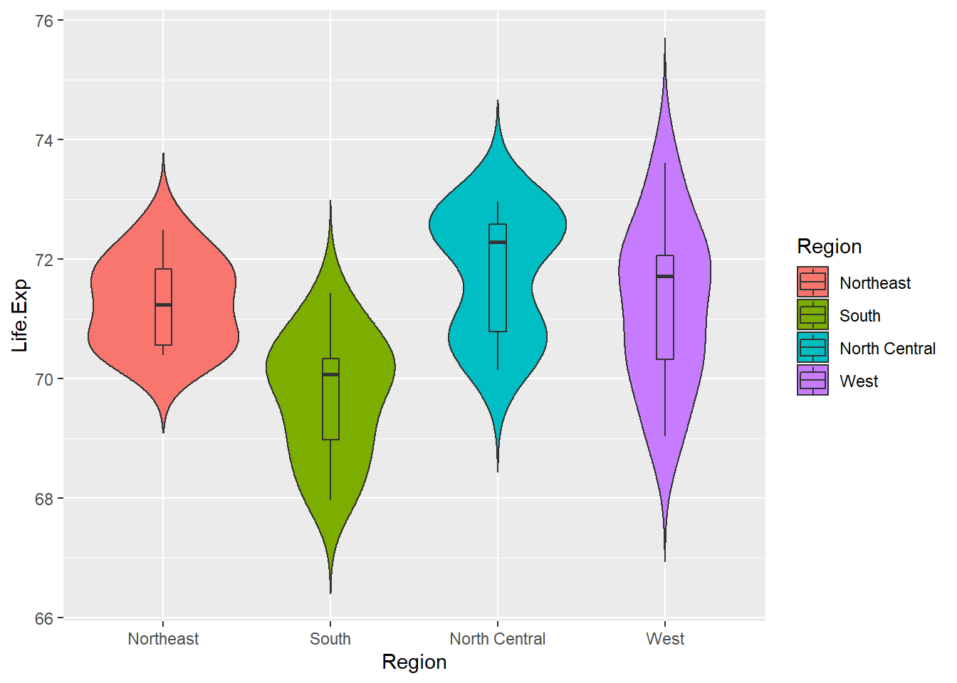
Figure 8.10: Regional life expectancy.
On average, the south has a lower life expectancy than the other three regions. North Central has the highest Life.Exp. West has extending distribution with two long tails on each end, which means some west states have very long life expectancy, while some states expect short life expectancy though they are in the same region.
According to the corrplot, there are other variables in the other cluster, such as life expectancy, high school graduation and income. We are interested in whether they affect the murder rate. Here is the plot for relationship between murder and these variables. Firstly we group the income into 5 IncomeTypes.
library(dplyr)
# group income into IncomeType first
sta.income <- sta %>% mutate(IncomeType = factor(ifelse(Income < 3500, "Under3500",
                             ifelse(Income < 4000 & Income >= 3500, "3500-4000",
                               ifelse(Income < 4500 & Income >= 4000, "4000-4500",
                                 ifelse(Income < 5000 & Income >= 4500, "4500-5000",
                                   "Above5000"))))))
ggplot(sta.income, aes(x = Murder, y = Life.Exp)) +
  geom_point(aes(shape = IncomeType, color = Region, size = HS.Grad)) +
  geom_smooth(method = 'lm', formula = y ~ x)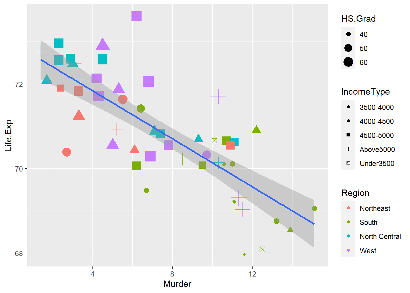
Figure 8.11: Relationship between murder rate and life expectancy, high school graduation, and income.
Murder is negatively correlated with Life.Exp. Some states with higher murder rates over 12 have relatively small symbols, which means their high school graduation rates are close to 40%; And these small symbols with murder rates bigger than 12 are all colored as green, which means they all belong to the south region.
It looks like the income type does not affect the murder rate a lot because all different symbols scatter around in different murder rates, especially between murder rates 8 and 10.
Most southern states have lower HS.Grad, lower Life.Exp but higher murder frequency, while states in the other three regions have relatively higher high school graduation rate and income but lower murder rate.
Exercise 8.6
Use a scatter plot to analyze the correlation between Illiteracy and those variables in the other cluster shown in Figure 8.6. Interpret your plot.
8.4 The whole picture of the data set
We analyzed the relationship of murder rate with the variables in both clusters. It looks like all variables are correlated, more or less. Now let’s see the whole picture of these variables. Heat map and Segment diagram are the popular methods.
library(gplots)
st.matrix <- as.matrix(st)    # Transfer the data frame to matrix
s <- apply(st.matrix, 2, function(y)(y - mean(y)) / sd(y))  # Standardize data
a <- heatmap.2(s,
          col = greenred(75), # Color green red
          density.info = "none",
          trace = "none",
          scale = "none",
          RowSideColors = rainbow(4)[sta$Region],
          srtCol = 45,        # Column labels at 45 degree
          margins = c(5, 8),  # Bottom and right margins
          lhei = c(5, 15)     # Relative heights of the rows
)
legend("topright", levels(sta$Region), fill = rainbow(4), cex = 0.8) # Add legend 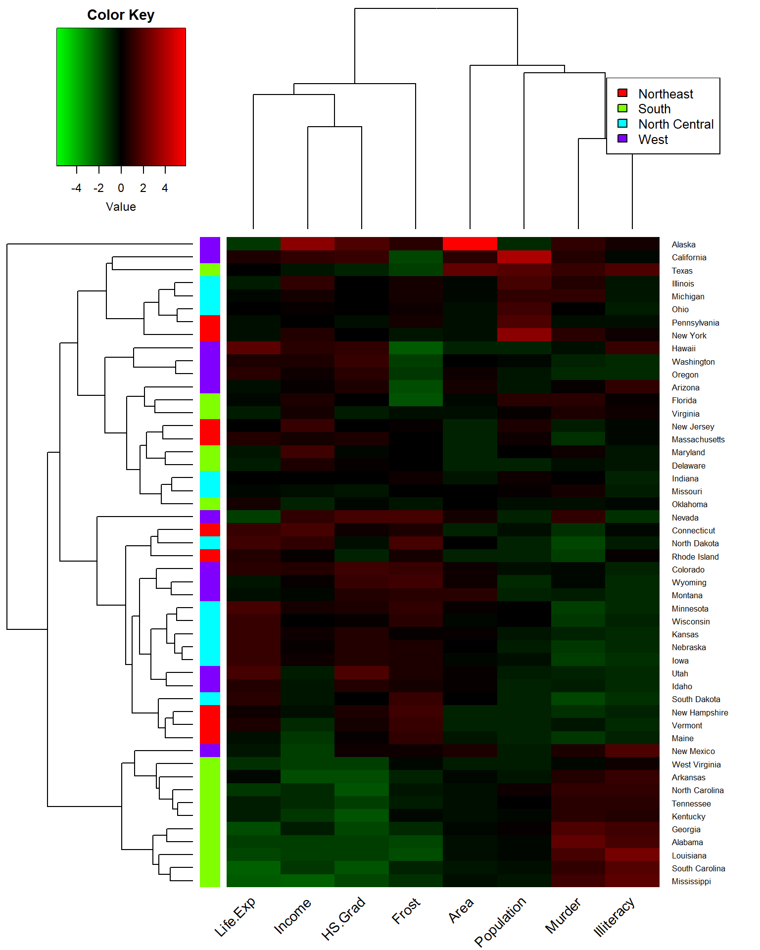
Figure 8.12: Heat map for whole state data set.
Same as cluster Dendrogram plot, Heatmap shows that Life.Exp, Income, HS.Grad, together with Frost build one cluster, while Illiteracy, Murder, Population, and area build another cluster.
Compared with other states, lots of southern states with lower Life.Exp, Income, and HS.Grad have higher Murder rates and Illiteracy, like Mississippi and Alabama. On the contrary, some northern and western states which have higher Life.Exp, Income, and HS.Grad show lower Area, Population, Murder, and Illiteracy, like Nebraska and South Dakota. Though the income of South Dakota show a little bit green.
row.names(st) <- sta$State
stars(st, key.loc = c(13, 1.5), draw.segments = T) 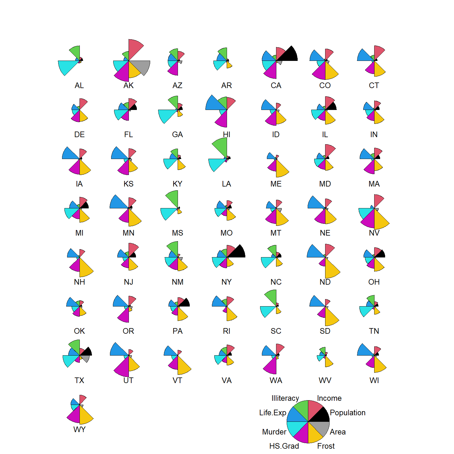
Figure 8.13: Segment diagram for all states.
The segment Diagram shows us different aspects of each state. For example, South Dakota has big Frost(yellow), big Life Expectancy(blue), a relatively high percentage of high school graduation rate(pink) and good income(red), but has a small area, and very tiny population, illiteracy, and murder rate compared with the other states.
We use principal components analysis to explore the data a little bit more!
pca = prcomp(st, scale = T)  # scale = T to normalize the data
pca
## Standard deviations (1, .., p=8):
## [1] 1.8970755 1.2774659 1.0544862 0.8411327 0.6201949 0.5544923 0.3800642
## [8] 0.3364338
##
## Rotation (n x k) = (8 x 8):
## PC1 PC2 PC3 PC4 PC5
## Population 0.12642809 0.41087417 -0.65632546 -0.40938555 0.405946365
## Income -0.29882991 0.51897884 -0.10035919 -0.08844658 -0.637586953
## Illiteracy 0.46766917 0.05296872 0.07089849 0.35282802 0.003525994
## Life.Exp -0.41161037 -0.08165611 -0.35993297 0.44256334 0.326599685
## Murder 0.44425672 0.30694934 0.10846751 -0.16560017 -0.128068739
## HS.Grad -0.42468442 0.29876662 0.04970850 0.23157412 -0.099264551
## Frost -0.35741244 -0.15358409 0.38711447 -0.61865119 0.217363791
## Area -0.03338461 0.58762446 0.51038499 0.20112550 0.498506338
## PC6 PC7 PC8
## Population -0.01065617 -0.062158658 -0.21924645
## Income 0.46177023 0.009104712 0.06029200
## Illiteracy 0.38741578 -0.619800310 -0.33868838
## Life.Exp 0.21908161 -0.256213054 0.52743331
## Murder -0.32519611 -0.295043151 0.67825134
## HS.Grad -0.64464647 -0.393019181 -0.30724183
## Frost 0.21268413 -0.472013140 0.02834442
## Area 0.14836054 0.286260213 0.01320320plot(pca) # Plot the amount of variance each principal components captures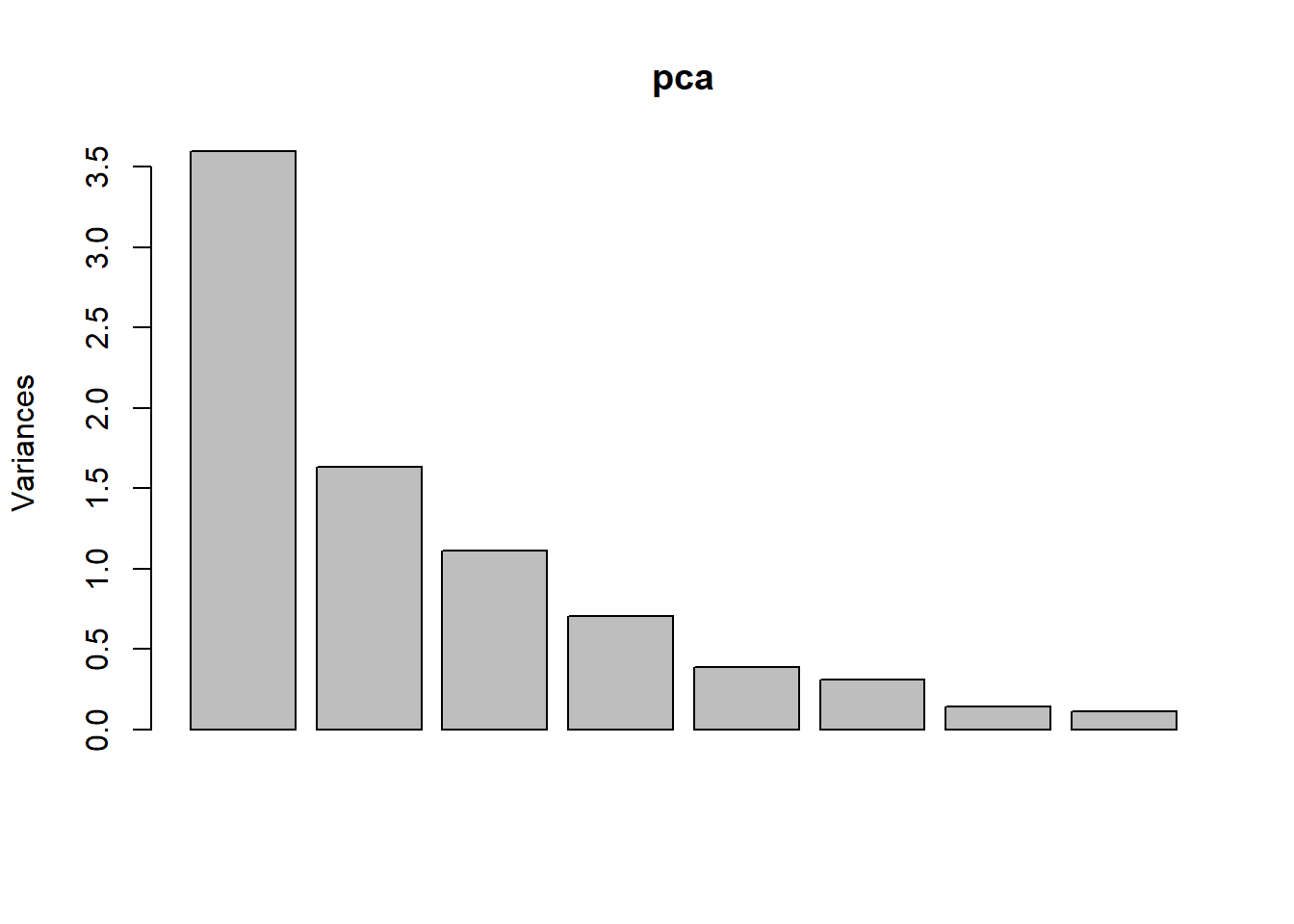
summary(pca) # Shows the importance of the components## Importance of components:
## PC1 PC2 PC3 PC4 PC5 PC6 PC7
## Standard deviation 1.8971 1.2775 1.0545 0.84113 0.62019 0.55449 0.38006
## Proportion of Variance 0.4499 0.2040 0.1390 0.08844 0.04808 0.03843 0.01806
## Cumulative Proportion 0.4499 0.6539 0.7928 0.88128 0.92936 0.96780 0.98585
## PC8
## Standard deviation 0.33643
## Proportion of Variance 0.01415
## Cumulative Proportion 1.00000percentVar <- round(100 * summary(pca)$importance[2, 1:7], 0) # Compute % variances
percentVar## PC1 PC2 PC3 PC4 PC5 PC6 PC7
## 45 20 14 9 5 4 2The first two components contribute 45% and 20%, together 65% of the variance. The third component is a little bit less but still over 10% of the variance. The bar plot of each component’s variance shows how the each component dominate.
library(ggfortify)
row.names(sta) <- sta$State
autoplot(prcomp(st,  scale = T), data = sta,
         colour = 'Region', shape = FALSE, label = TRUE, label.size = 3.5,
         loadings = TRUE, loadings.colour = 'blue', loadings.label = TRUE,
         loadings.label.size = 4, loadings.label.colour = 'blue')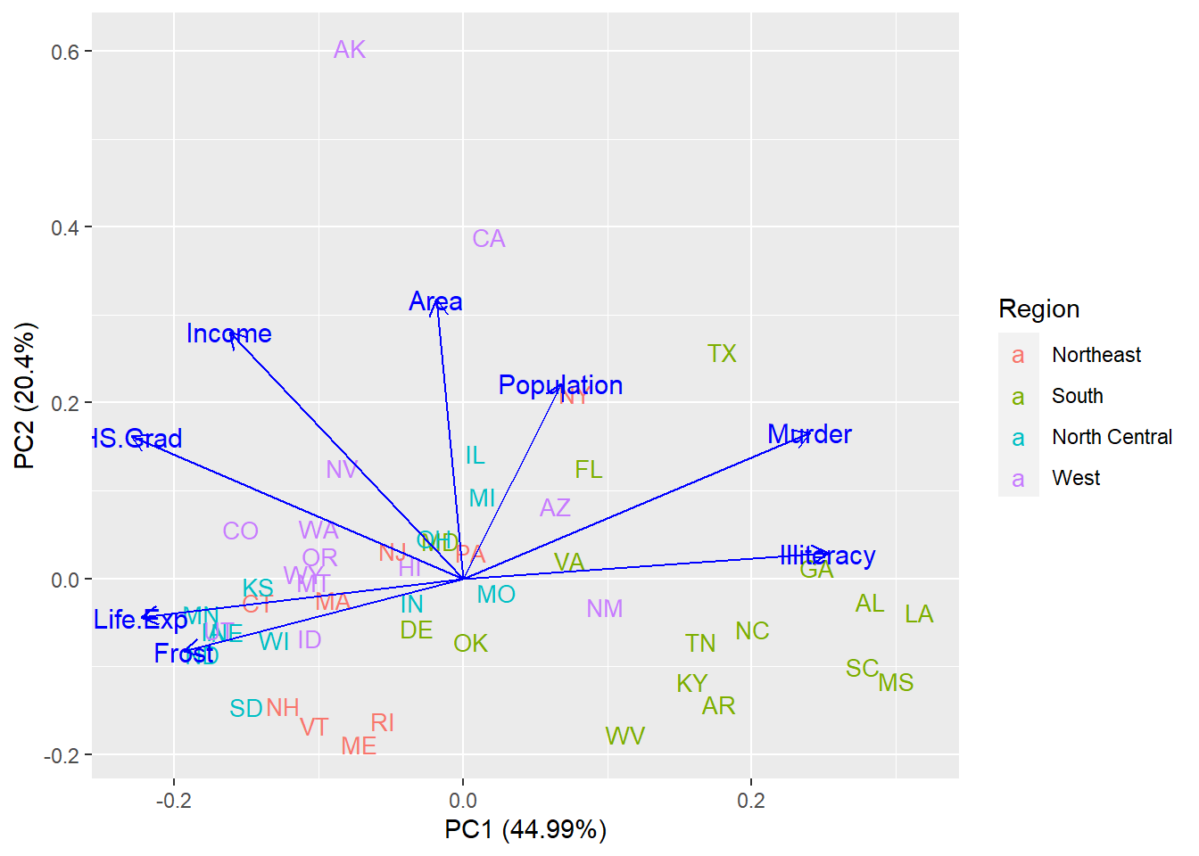
Figure 8.14: Biplot for PCA.
The Biplot illustrates the special role of these variables to the first and second components of the variance. Illiteracy positively contributes to the component of the variance PC1, while Life.Exp and Frost negatively contribute to the component of the variance PC1. Area positively contributes to the component of the variance PC2. The other four variables contribute to both components of the variance PC1 and PC2 positively or negatively. From the figure, we also find that many states in the south region, such as Louisiana(LA) and Mississippi(MS) are well-known for their big Illiteracy and high murder rate, while some north-central states like Minnesota(MN) and North Dakota(ND) are noticed for their high life expectancy and long frost time. Big area is the special feature for two states in the west region, Alaska(AK) and California(CA).
8.5 Linear model analysis
According to the analysis above, we try to find a model to explain the murder rate. Because of the high correlation of HS.Grad with Illiteracy, Life.Exp, and Income, we will not put HS.Grad in the model. For a similar reason, we leave Frost out too.
lm.data <- sta[, c(2:6, 9:10)]
lm.data <- within(lm.data, Region <- relevel(Region, ref = "South"))  # Set region South as reference
model <- lm(Murder ~ .,  data = lm.data)
summary(model)
##
## Call:
## lm(formula = Murder ~ ., data = lm.data)
##
## Residuals:
## Min 1Q Median 3Q Max
## -2.8178 -0.9446 -0.1485 1.0406 3.5501
##
## Coefficients:
## Estimate Std. Error t value Pr(>|t|)
## (Intercept) 1.059e+02 1.601e+01 6.611 5.85e-08 ***
## Population 2.591e-04 5.439e-05 4.764 2.39e-05 ***
## Income 2.619e-04 4.870e-04 0.538 0.59362
## Illiteracy 1.861e+00 5.567e-01 3.343 0.00178 **
## Life.Exp -1.445e+00 2.275e-01 -6.351 1.37e-07 ***
## Area 1.133e-06 3.407e-06 0.333 0.74117
## RegionNortheast -2.673e+00 8.020e-01 -3.333 0.00183 **
## RegionNorth Central -7.182e-01 8.712e-01 -0.824 0.41451
## RegionWest 2.358e-01 8.096e-01 0.291 0.77229
## ---
## Signif. codes: 0 '***' 0.001 '**' 0.01 '*' 0.05 '.' 0.1 ' ' 1
##
## Residual standard error: 1.552 on 41 degrees of freedom
## Multiple R-squared: 0.852, Adjusted R-squared: 0.8232
## F-statistic: 29.51 on 8 and 41 DF, p-value: 1.168e-14Murder rate is most related to Life Expectancy and Population of the state, also it is affected by Illiteracy of the state. The region is another factor contributing to murder rate. The estimates illustrate that every unit of increase in Life.Exp expects 1.445 units lower of murder rate, while every unit of increase in population and illiteracy will increase 0.000259 and 1.861 units of the murder rate. At the same time, if the state belongs to the northeast region, the murder rate will be 2.673 units less. The model will explain 82% of the variance of the murder rate. If we know the population, Life.Exp, Illiteracy of the certain state in those years, we can estimate murder rate as follow: \(Murder = 105.9 - 1.445 * Life.Exp + 0.000259 * Population + 1.861 * Illiteracy - 2.673 * RegionNortheast\)
Exercise 8.7
Do a linear model analysis for Illiteracy and interpret your result. Hint: Check the corrplot figure 8.5 and pay attention to the high correlation between murder rate and life expectancy.
8.6 Conclusion
-Southern region shows a higher murder rate with lower life expectancy, income, and high school graduation rate but higher illiteracy, while northern region shows a lower murder rate with higher population density, life expectancy, income, and high school graduation rate but lower illiteracy.
-The information of life expectancy, population, illiteracy of the state in the 1970s, and whether the state belongs to the northeast region will help to estimate the murder rate of the state at that time.