Chapter 6 The heart attack dataset (II)
We continue to investigate the heart attack dataset. First, let’s read in the data again and change several variables to factors. Note that you must set the working directory to where the data file is stored on your computer. I encourage you to define a project associated with a folder.
# set working directory, not necessary if loading a project
#setwd("C:/Ge working/RBook/learnR/datasets")
df <- read.table("datasets/heartatk4R.txt", sep = "\t", header = TRUE)  # read data
df$DRG <- as.factor(df$DRG)  # convert DRG variable to factor
df$DIED <- as.factor(df$DIED)
df$DIAGNOSIS <- as.factor(df$DIAGNOSIS)
df$SEX <- as.factor(df$SEX)
str(df)  # double check
## 'data.frame': 12844 obs. of 8 variables:
## $ Patient : int 1 2 3 4 5 6 7 8 9 10 ...
## $ DIAGNOSIS: Factor w/ 9 levels "41001","41011",..: 5 5 9 8 9 9 9 9 5 5 ...
## $ SEX : Factor w/ 2 levels "F","M": 1 1 1 1 2 2 1 1 2 1 ...
## $ DRG : Factor w/ 3 levels "121","122","123": 2 2 2 2 2 1 1 1 1 3 ...
## $ DIED : Factor w/ 2 levels "0","1": 1 1 1 1 1 1 1 1 1 2 ...
## $ CHARGES : num 4752 3941 3657 1481 1681 ...
## $ LOS : int 10 6 5 2 1 9 15 15 2 1 ...
## $ AGE : int 79 34 76 80 55 84 84 70 76 65 ...6.1 Scatter plot in ggplot2
Hadley Wickham wrote the ggplot2 package in 2005 following Leland Wilkinson’s grammar of graphics, which provides a formal, structured way of visualizing data. Similarly, R was originally written by Robert Gentleman and Ross Ihaka in the 1990s; Linux was developed by Linus Torvalds, a student, at the same period. A few superheroes can make computing much easier for millions of people. ggplot2 uses a different approach to graphics.
library(ggplot2)  # load the package
ggplot(df, aes(x = LOS, y = CHARGES))  # Specify data frame and aesthetic mapping
This line does not finish the plot; it just specifies the name of the data frame, which is the required input data type, and defines the so-called aesthetic mapping: LOS maps to x-axis while CHARGES maps to the y-axis. To complete the plot, we use the geom_point function to add data points, which is called geometric objects.
ggplot(df, aes(x = LOS, y = CHARGES)) + geom_point() # scatter plotThus, it is a two-step process to generate a scatter plot. This seems cumbersome at first, but it is convenient to add additional features or customize the plot step by step. Let’s add a trend line with a confidence interval.
ggplot(df, aes(x = LOS, y = CHARGES)) + geom_point() + stat_smooth(method = lm)As we keep adding elements to the plot, this line of code gets longer. So we break the code into multiple lines as below. The “+” at the end of the line signifies that the plot is not finished and tell R to keep reading the next line. This code below does the same thing as the above, but it is easier to read. I often use the tab key in the second line to remind myself that it is continued from the above line.
ggplot(df, aes(x = LOS, y = CHARGES)) +  # aesthetic mapping
         geom_point() +                    # add data points
       stat_smooth(method = lm)          # add trend line
As you can see from this code, it also enables us to add comments for each step, making the code easy to read. This is important, as we often recycle our codes.
We can also customize the plot by adding additional lines of code (Figure 6.1):
ggplot(df, aes(x = LOS, y = CHARGES)) +                 # aesthetic mapping
       geom_point() +                                   # add data points
       stat_smooth(method = lm) +                       # add trend line
       xlim(0, 25) +                                        # change plotting limits of x-axis
       labs(x = "Length of stay", y = "Charges ($)") +  # change x and y labels
       annotate("text", x = 3, y = 45000, label = ("R = 0.74"))  # add text to plot coordinates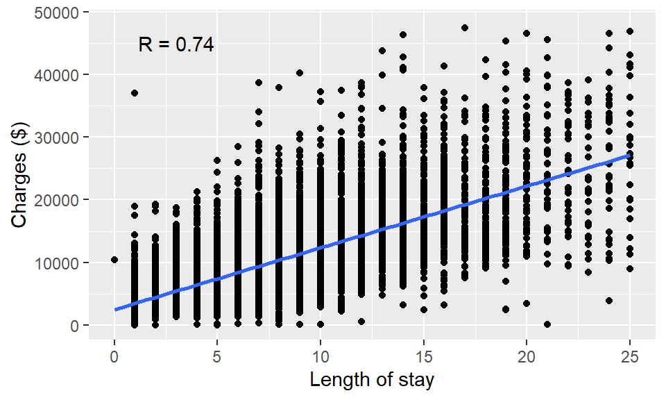
Figure 6.1: Scatter plot using ggplot2.
You can learn other ways to customize your plot by googling. For example, try to find a way to add title to the plot by using keyword “ggplot2 add title to plot.”
It is easy to represent other characteristics of data points (columns) using additional aesthetic mappings, such as linetype, color, size, fill (“inside” color).
ggplot(df, aes(x = LOS, y = CHARGES)) + geom_point()               # basic scatter plot
ggplot(df, aes(x = LOS, y = CHARGES, color = DRG)) + geom_point() # map DRG to colorggplot(df, aes(x = LOS, y = CHARGES, color = DRG, shape = SEX)) + # map SEX to shape
geom_point()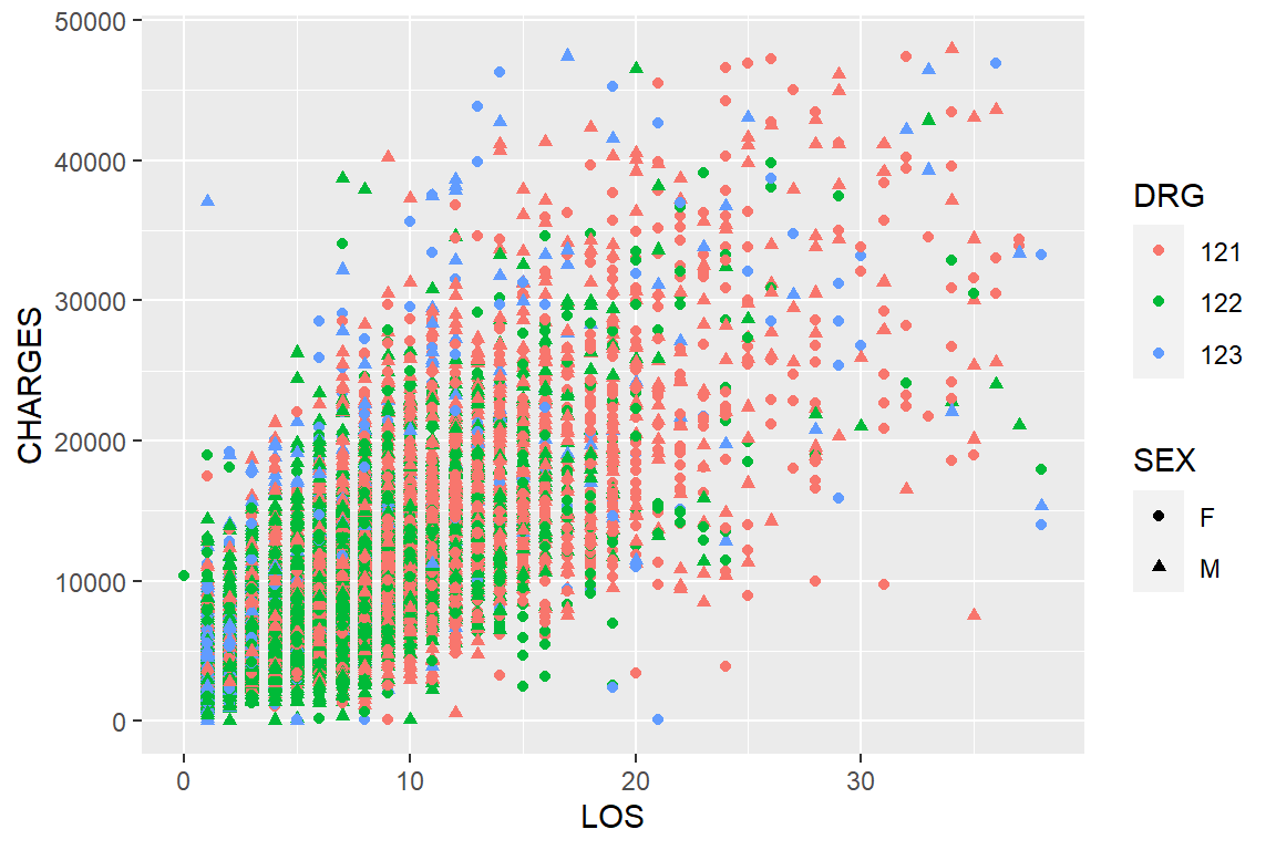
Figure 6.2: Changing color and shape to represent multivariate data in ggplot2.
At each step, we add additional information about these patients (Figure 6.2). With ggplot2, we can visualize complex, multivariate data by mapping different columns into diverse types of aesthetics. Figure 6.1 shows a strong positive correlation between charges and length of hospital stay, which is expected as many itemized costs are billed daily. Note there are over 12,000 data points on these plots, many are plotted near or exactly at the same places, especially at the lower left corner. stat_density2d() can be used to color code density.
These plots are big in file size when you save it in a vector format (metafile), which often offer higher resolution. If you have many such plots in a paper or thesis, your file size can be big. These problems can be avoided if you use the bitmap format.
Exercise 6.1
Use ggplot2 to generate a scatter plot of age vs. charges in the heart attack dataset. Use different shapes of data points to represent DRG and color-code data points based on diagnosis.
heartatk4R <- read.table(_______________________________)
ggplot(heartatk4R, aes(x = _______, y = ________, color = _________, shape = _________)) +
geom_point()
6.2 Histograms and density plots
In addition to data points(geom_points), there are many other geometric objects, such as histogram(geom_histogram), lines (geom_line), and bars (geom_bar), and so on. We can use these geometric objects to generate different types of plots. To plot a basic histogram:
ggplot(df, aes(x = AGE)) + geom_histogram()Then we can refine it and add a density curve (Figure 6.3):
ggplot(df, aes(x = AGE, y = ..density..)) +
       geom_histogram(fill = "cornsilk",
                      colour = "grey60", size = .2) +
       geom_density()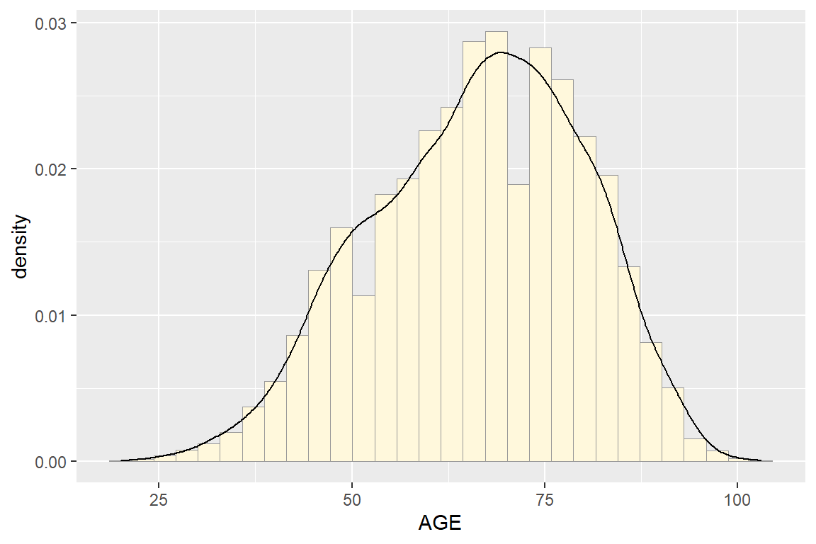
Figure 6.3: Histogram with density curve.
Combined density plots are useful in comparing the distribution of subgroups of data points.
ggplot(df, aes(x = AGE)) + geom_density(alpha = 0.3) # all dataUse color to differentiate sex:
ggplot(df, aes(x = AGE, color = SEX)) + geom_density(alpha = 0.3) # Figure 6.4AHere, we split the dataset into two portions, men and women, and plotted their density distribution on the same plot. Figure 6.4A shows that age distribution is very different between men and women. Women’s distribution is skewed to the right and they are on average over ten years older than men. This is surprising, given that this dataset contains all heart attack admissions in New York state in 1993.
The fill mapping changes the “inside” color:
ggplot(df, aes(x = AGE, fill = SEX)) + geom_density(alpha = 0.3) # Figure 6.4BThis plot shows the same information. It looks nicer, at least to me. We can split the plot into multiple facets:
ggplot(df, aes(x = AGE, fill = SEX)) +
       geom_density(alpha = 0.3) + facet_grid(DRG ~.)  # Figure 6.4C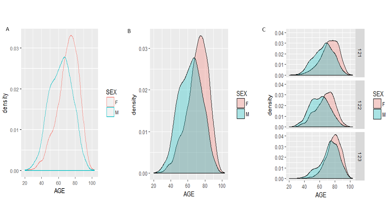
Figure 6.4: Density plots.
Recall the DRG=121 represents patients who survived but developed complications; DRG=122 denotes those without complications and DRG=123 are patients who did not survive. Figure 6.4C suggests that women in all three groups are older than men counterparts. If we examine the distribution of male patients’ age distribution across facets, we can see that the distribution is skewed to the right in deceased patients (DRG=123), indicating that perhaps older people are less likely to survive a heart attack. Survivors without complications (DRG= 122) tend to be younger than survivors with complications.
Exercise 6.2
Create density plots like Figure 6.5 to compare the distribution of length of hospital stay (LOS) for patients with different DRG groups, separately for men and women. Offer interpretation in the context of the dataset. Limit the x-axis to 0 to 20.
ggplot(heartatk4R, aes(_________, _________)) + ______________(alpha = 0.3) +
_________(________ ~ .) + xlim(________, _____)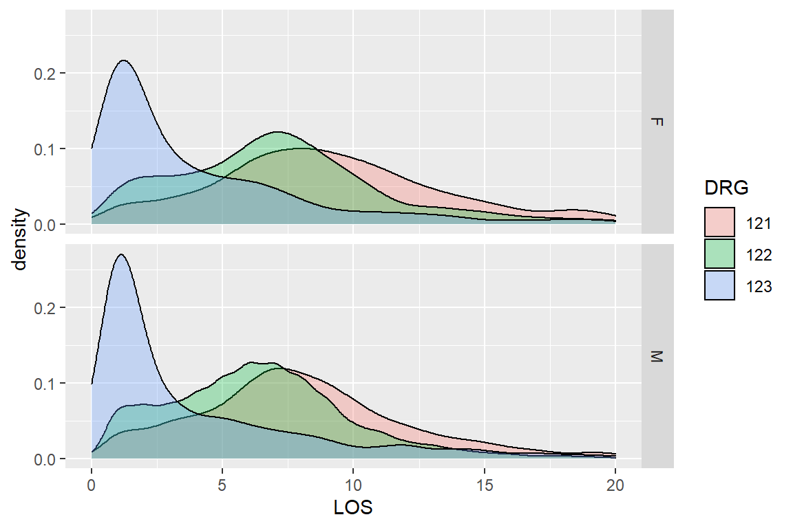
Figure 6.5: Distribution of LOS by DRG groups grouped by SEX
6.3 Box plots and Violin plots
We can follow the same rule to generate boxplots using the geom_boxplot ( ). Let’s start with a basic version.
ggplot(df, aes(x = SEX, y = AGE)) + geom_boxplot()  # basic boxplot
ggplot(df, aes(x = SEX, y = AGE)) + geom_boxplot() + facet_grid(DRG ~ .)  # Figure 6.6A
ggplot(df, aes(x = SEX, y = AGE)) + geom_violin() + facet_grid(DRG ~ .)  # Figure 6.6B
The last version is a violin plot. It shows more details about the distribution as it is essentially density plots on both left and right sides of the violins.
Exercise 6.3
Generate a violin plot like Figure 6.6C to compare the distribution of length of hospital stay among patients with different prognosis outcomes (DRG), separately for men and women. Interpret your result. Note the axes labels are customized.
ggplot(heartatk4R, ___________________) + _____________ + ______________ +
labs(x = “DRG groups,” y = “Length of Stay(days)”) + ylim(0, 20)
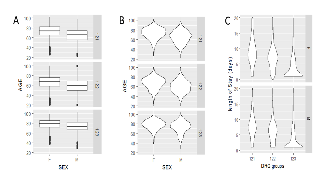
Figure 6.6: Boxplot and violin plots using ggplot2
6.4 Bar plot with error bars
Suppose we are interested in examining whether people with certain diagnosis codes stays longer or shorter in the hospital after a heart attack. We can, of course, use the aggregate function to generate a table with means LOS by category.
aggregate(df, by = list(df$DIAGNOSIS), FUN = mean, na.rm = TRUE)## Group.1 Patient DIAGNOSIS SEX DRG DIED CHARGES LOS AGE
## 1 41001 7130.229 NA NA NA NA 10868.030 7.775161 65.56317
## 2 41011 6413.323 NA NA NA NA 10631.803 7.728618 65.81305
## 3 41021 6482.808 NA NA NA NA 10666.687 7.556000 63.96000
## 4 41031 6356.028 NA NA NA NA 9908.118 6.679715 62.93950
## 5 41041 6259.752 NA NA NA NA 9985.722 7.307692 63.73884
## 6 41051 6438.974 NA NA NA NA 9062.423 7.298701 67.22078
## 7 41071 6949.627 NA NA NA NA 9750.309 7.834997 69.01996
## 8 41081 8384.725 NA NA NA NA 9633.123 7.048780 68.04181
## 9 41091 6165.481 NA NA NA NA 9511.093 7.625743 67.10359We can be happy with this table and call it quits. However, tables are often not as easy to interpret as a nicely formatted graph. Instead of the aggregate function, we use the powerful dplyr package to summarize the data and then to generate a bar plot showing both the means and standard errors. I stole some code and ideas from R graphics cookbook and this website: http://environmentalcomputing.net/plotting-with-ggplot-bar-plots-with-error-bars/.
library(dplyr) # load the packageTo summarize data by groups/factors, the dplyr package uses a similar type of grammar like ggplot2, where operations are added sequentially. Similar to pipes in Unix, commands separated by “%>%” are executed sequentially where the output of one step becomes the input of the next. The follow 6 lines are part of one command, consisting of three big steps.
stats <- df %>%  # names of the new data frame and the data frame to be summarized
  group_by(DIAGNOSIS) %>%  # grouping variable
  summarise(mean = mean(LOS),  # mean of each group
            sd   = sd(LOS),    # standard deviation of each group
            n    = n(),        # sample size per group
            se   = sd(LOS) / sqrt(n()))  # standard error of each group
The resultant data frame is a detailed summary of the data by DIAGNOSIS:
stats## # A tibble: 9 x 5
## DIAGNOSIS mean sd n se
## <fct> <dbl> <dbl> <int> <dbl>
## 1 41001 7.78 5.69 467 0.263
## 2 41011 7.73 5.34 1824 0.125
## 3 41021 7.56 5.26 250 0.333
## 4 41031 6.68 4.15 281 0.247
## 5 41041 7.31 4.75 2665 0.0920
## 6 41051 7.30 4.54 154 0.366
## 7 41071 7.83 5.28 1703 0.128
## 8 41081 7.05 5.32 287 0.314
## 9 41091 7.63 5.14 5213 0.0712Now we can use ggplot2 to plot these statistics (Figure 6.7):
ggplot(stats, aes(x = DIAGNOSIS, y = mean)) +   # data & aesthetic mapping
         geom_bar(stat = "identity") +            # bars represent average
         geom_errorbar(aes(ymin = mean - se, ymax = mean + se), width = 0.2)  # error bars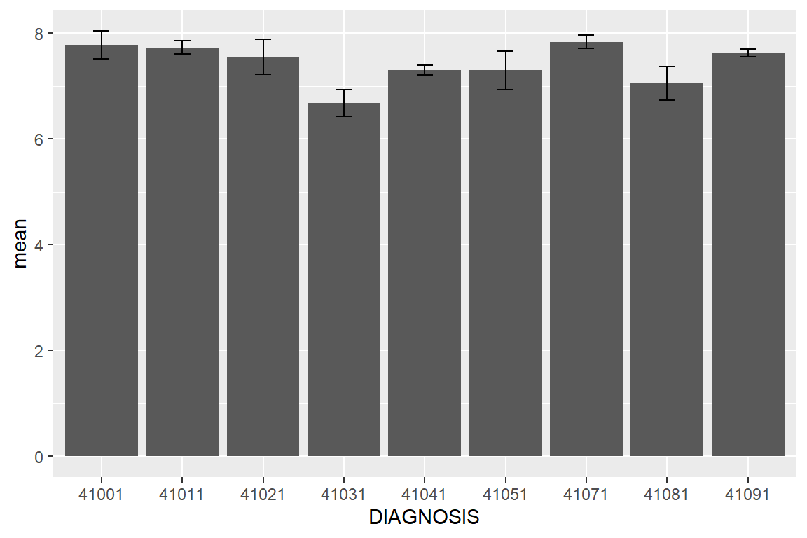
Figure 6.7: Average LOS by DIAGNOSIS group with error bars representing standard error.
Note that the mean-se and mean+se refer to the two columns in the stats data frame and define the error bars. Because we have an extremely large sample size, the standard errors are small. People with a diagnosis of 41031 stay shorter in the hospital. By looking up the IDC code in http://www.nuemd.com, we notice that this code represents “Acute myocardial infarction of inferoposterior wall, initial episode of care,” which probably makes sense.
As we did previously, we want to define the LOS bars for men and women separately. We first need to go back and generate different summary statistics.
stats2 <- df %>%
  group_by(DIAGNOSIS, SEX) %>%   # two grouping variables
  summarise(mean = mean(LOS),
            sd   = sd(LOS),
            n    = n(),
            se   = sd(LOS) / sqrt(n()))
The entire dataset was divided into 18 groups according to all possible combinations of DIAGNOSIS and SEX. For each group, the LOS numbers are summarized in terms of mean, standard deviation (sd), observations (n), and standard errors(se). Below is the resultant data frame with summary statistics:
stats2## # A tibble: 18 x 6
## # Groups: DIAGNOSIS [9]
## DIAGNOSIS SEX mean sd n se
## <fct> <fct> <dbl> <dbl> <int> <dbl>
## 1 41001 F 8.74 6.03 175 0.456
## 2 41001 M 7.20 5.41 292 0.316
## 3 41011 F 8.41 6.23 692 0.237
## 4 41011 M 7.31 4.66 1132 0.139
## 5 41021 F 8.54 5.82 100 0.582
## 6 41021 M 6.9 4.76 150 0.389
## 7 41031 F 6.41 4.67 96 0.477
## 8 41031 M 6.82 3.86 185 0.283
## 9 41041 F 7.79 5.18 998 0.164
## 10 41041 M 7.02 4.45 1667 0.109
## 11 41051 F 7.93 5.64 69 0.679
## 12 41051 M 6.79 3.34 85 0.362
## 13 41071 F 8.65 5.76 727 0.214
## 14 41071 M 7.23 4.80 976 0.154
## 15 41081 F 7.58 5.60 130 0.492
## 16 41081 M 6.61 5.04 157 0.402
## 17 41091 F 8.34 5.76 2078 0.126
## 18 41091 M 7.15 4.63 3135 0.0826Now we are ready to generate bar plot for men and women separately using the fill aesthetic mapping:
ggplot(stats2, aes(x = DIAGNOSIS, y = mean, fill = SEX)) + # mapping
geom_bar(stat = "identity", position = "dodge") + # bars for mean of LOS
labs(x = "Diagnosis codes", y = "Length of Stay") + # axes labels
geom_errorbar(aes(ymin = mean - se, ymax = mean + se), # error bars
position = position_dodge(.9), width = 0.2)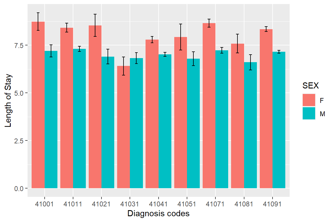
Figure 6.8: The length of stay summarized by diagnosis and sex. Error bars represent standard error.
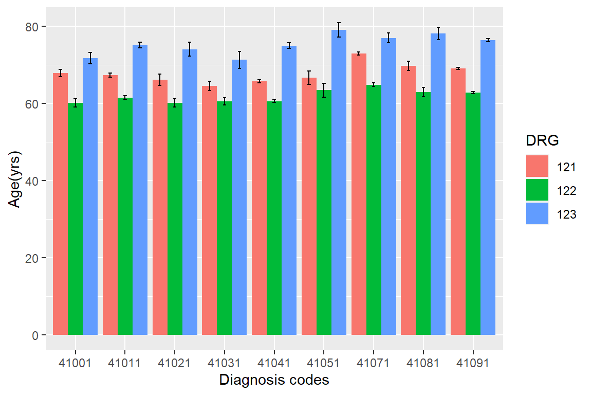
Figure 6.9: Mean ages for patients with different diagnosis and treatment outcome.
Exercise 6.4
Generate Figure 6.9 and offer your interpretation. Hint: Modify both the summarizing script and the plotting script.
df <- heartatk4R %>%
_____________(DIAGNOSIS, DRG) %>% # two grouping variables
_____________(mean = mean(AGE),
sd = sd(AGE),
n = n(),
se = sd(AGE) / sqrt(n()))
ggplot(df, aes(_________________________) + # mapping
_______________(stat = “identity,” position = “dodge”) + # bars mean
_______________(x = “Diagnosis codes,” y = “Age(yrs)”) + # axes labels
_______________(aes(__________________, ________________), # error bars
position = position_dodge(.9), width = 0.2)
Overall, our investigation reveals that women are much older than men when admitted to hospital for heart attack. Therefore, prognosis is also poor with high mortality and complication rates. It is probably not because they develop heart attack later in life. It seems that symptoms are subtler in women and often get ignored. Heart attack can sometimes manifest as back pain, numbness in the arm, or pain in the jaw or teeth! (Warning: statistics professor is talking about medicine!)
As you could see from these plots, ggplot2 generates nicely-looking, publication-ready graphics. Moreover, it is a relatively structured way of customizing plots. That is why it is becoming popular among R users. Once again, there are many example codes and answered R coding questions online. Whatever you want to do, you can google it, try the example code, and modify it to fit your needs. It is all free! Enjoy coding!
6.5 Statistical models are easy; interpretations and verifications are not!
By using pair-wised correlation analysis, we found that women have a much higher mortality rate than men due to heart attack. We also found that women are much older than men. These are obviously confounding effects.
We need to delineate the effects of multiple factors using multiple linear regression. In our model below, we express the charges as a function of all other factors using multiple linear regression.
fit <- lm(CHARGES ~ SEX + LOS + AGE + DRG + DIAGNOSIS, data = df)
summary(fit)
##
## Call:
## lm(formula = CHARGES ~ SEX + LOS + AGE + DRG + DIAGNOSIS, data = df)
##
## Residuals:
## Min 1Q Median 3Q Max
## -31486 -2453 -674 1766 32979
##
## Coefficients:
## Estimate Std. Error t value Pr(>|t|)
## (Intercept) 6863.753 314.515 21.823 < 2e-16 ***
## SEXM 183.085 84.131 2.176 0.02956 *
## LOS 989.717 8.268 119.700 < 2e-16 ***
## AGE -55.255 3.216 -17.180 < 2e-16 ***
## DRG122 -916.531 86.851 -10.553 < 2e-16 ***
## DRG123 1488.187 141.771 10.497 < 2e-16 ***
## DIAGNOSIS41011 -136.097 230.312 -0.591 0.55458
## DIAGNOSIS41021 137.118 349.948 0.392 0.69520
## DIAGNOSIS41031 201.021 334.056 0.602 0.54735
## DIAGNOSIS41041 -349.932 223.352 -1.567 0.11720
## DIAGNOSIS41051 -1162.651 408.621 -2.845 0.00444 **
## DIAGNOSIS41071 -755.549 233.214 -3.240 0.00120 **
## DIAGNOSIS41081 -353.290 332.747 -1.062 0.28838
## DIAGNOSIS41091 -1042.968 215.038 -4.850 1.25e-06 ***
## ---
## Signif. codes: 0 '***' 0.001 '**' 0.01 '*' 0.05 '.' 0.1 ' ' 1
##
## Residual standard error: 4308 on 12131 degrees of freedom
## (699 observations deleted due to missingness)
## Multiple R-squared: 0.569, Adjusted R-squared: 0.5685
## F-statistic: 1232 on 13 and 12131 DF, p-value: < 2.2e-16As we could see from above, one level for each factor(such as female) is used as a base for comparison, so it does not show. SEXM indicates that being male, we have a marginally significant effect on charges. Everything else being equal, a male patient will incur $183 dollars more cost than female for the hospital stay. It is really small number compared to overall charges and also the p value is just marginally significant for this large sample(0.02956). This is in contrast to the t.test(CHARGES ~ SEX) shown below, when we got the opposite conclusion with much smaller p value of 4.573e-07. It is because we did not control for other factors.
t.test(CHARGES ~ SEX, data = df)##
## Welch Two Sample t-test
##
## data: CHARGES by SEX
## t = 5.047, df = 9355.3, p-value = 4.573e-07
## alternative hypothesis: true difference in means between group F and group M is not equal to 0
## 95 percent confidence interval:
## 384.9901 873.9597
## sample estimates:
## mean in group F mean in group M
## 10260.660 9631.185Back to our multiple linear regression model we can see that the most pronounced effect is LOS. This is not surprising, as many hospitals have charges on daily basis. Since the p values are cutoff at 2e-16, the t value is an indicator of significance. LOS has a t value of 119.7, which is way bigger than all others. If I am an insurance company CEO, I will do anything I can to push the hospitals to discharge patients as early as possible. The coefficients tell us for the average patient, one extra day of stay in the hospital the charges will go up by $989.7. Age has a negative effect, meaning older people actually will be charged less, when other factors are controlled. So there is no reason to charge older people more in terms of insurance premiums. And there is a little evidence to charge female more than males. Compared with patients who had complications (DRG = 121, the baseline), people have no complications (DRG = 122) incurred less charges on average by the amount of $916. Patients who died, on the other hand, are likely to be charged more. People with diagnosis codes 41091, 41051 and 41071 incurred less charges compared with those with 41001.
To investigate mortality, which is a binary outcome, we use logistic regression.
fit <- glm(DIED ~ SEX + LOS + AGE + DIAGNOSIS, family = binomial( ), data = df)
summary(fit)
##
## Call:
## glm(formula = DIED ~ SEX + LOS + AGE + DIAGNOSIS, family = binomial(),
## data = df)
##
## Deviance Residuals:
## Min 1Q Median 3Q Max
## -1.7745 -0.4583 -0.2813 -0.1517 4.4996
##
## Coefficients:
## Estimate Std. Error z value Pr(>|z|)
## (Intercept) -5.359769 0.263001 -20.379 < 2e-16 ***
## SEXM -0.345084 0.064978 -5.311 1.09e-07 ***
## LOS -0.248553 0.009197 -27.025 < 2e-16 ***
## AGE 0.081122 0.002995 27.082 < 2e-16 ***
## DIAGNOSIS41011 -0.404406 0.157454 -2.568 0.01022 *
## DIAGNOSIS41021 -0.336452 0.254026 -1.324 0.18534
## DIAGNOSIS41031 -0.784819 0.262089 -2.994 0.00275 **
## DIAGNOSIS41041 -0.991677 0.158059 -6.274 3.52e-10 ***
## DIAGNOSIS41051 -0.235784 0.279752 -0.843 0.39932
## DIAGNOSIS41071 -1.719416 0.178522 -9.631 < 2e-16 ***
## DIAGNOSIS41081 -0.484542 0.226713 -2.137 0.03258 *
## DIAGNOSIS41091 -0.677723 0.145463 -4.659 3.18e-06 ***
## ---
## Signif. codes: 0 '***' 0.001 '**' 0.01 '*' 0.05 '.' 0.1 ' ' 1
##
## (Dispersion parameter for binomial family taken to be 1)
##
## Null deviance: 8889.4 on 12843 degrees of freedom
## Residual deviance: 6844.2 on 12832 degrees of freedom
## AIC: 6868.2
##
## Number of Fisher Scoring iterations: 6Note that DIED is 1 for people died, and 0 otherwise. So a negative coefficient indicates less likely to die, hence more likely to survive. Males are more likely to survive heart attack, compared with females of the same age, and with the same diagnosis. People who stayed longer are less likely to die. Older people are more likely to die. Compared with people with diagnosis code of 41001, those diagnosed with 41071, 41041, and 41091, are more likely to survive.
Exercise 6.5
Use multiple linear regression to investigate the factors associated with length of stay. Obviously we need to exclude charges in our model. Interpret your results.
fit <- ___________(LOS ~ SEX + AGE + DRG + DIAGNOSIS, data = ___________)
___________(fit)
This is not part of the exercise, but another problem we could look into is who are more likely to have complications. We should only focuse on the surviving patients and do logistic regression.
We still need pair-wised examinations, because we cannot put two highly correlated factors in the same model.