Chapter 1 Step into R programming–the iris flower dataset
Learning objectives:
- Use R from Rstudio Cloud or local install.
- RStudio interface: Console, Script, Environment, Plots.
- Data frames and vectors.
- The basics workflow: import data, check data types, define vectors from columns, plot and analyze.
1.1 Getting started
You can use R and Rstudio through a web browser via Rstudio Cloud. Create a free account, or just log-in with your Google account. Click the New Project button to get started.
Alternatively, you can install R on your laptop from www.R-project.org. Then install RStudio Desktop from www.RStudio.com. If you have an older version of R or Rstudio, we recommend uninstall them, delete the folder that holds the R packges, and reinstall the latest versions.
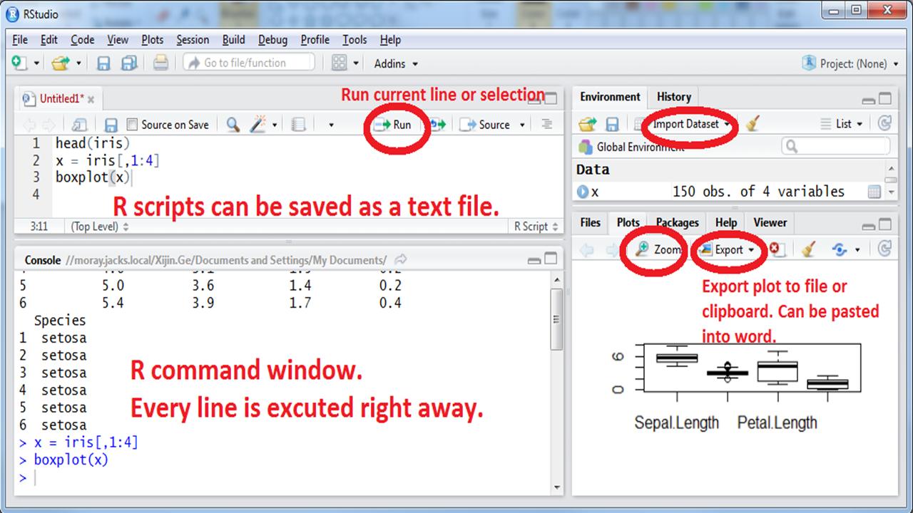
Figure 1.1: Interface of RStudio.
RStudio uses R in the background but provides a more user-friendly interface. R commands can be typed directly into the “Console” window. See Figure 1.1.
As a quick sample session, try all of these commands below in the Console window. R is case-sensitive; “Species” and “species” are two different variables. If you understand all of these, you probably do not need this book; consider more advanced books like R for Data Science. If it takes you a few months to type these 248 characters, try www.RapidTyping.com first.
head(iris)
str(iris)
summary(iris)
df <- iris[, 1:4]
boxplot(df)
pairs(df)
stars(df)

PL <- df$Petal.Length
barplot(PL)
hist(PL)
SP <- iris$Species
pie(table(SP))
boxplot(PL ~ SP)
summary(aov(PL ~ SP))

PW <- df$Petal.Width
plot(PL, PW, col = SP)
abline(lm(PW ~ PL))
Animated GIF for screen shot.
1.2 The proper way of using RStudio
Create a project. An RStudio project is a nice way to organize and compartmentalize different tasks. The idea is, for a new research project, we put all related files (source code, data, results) into a designated folder. On RStudio.cloud, you have to do this to initiate an R session. Click on the Untitled Project on the top of the window to rename it as something meaningful, such as “Workshop.” If you are running R locally, click File from the main menu, and select New Project. Then follow directions to choose or create a folder.
Create a script file by going to File > New File > R Script. Or click on the green plus sign. Instead of typing our commands directly into the console window, we will type in the R Script window, which could be saved as a record. To execute one line of code, click anywhere in the line and click the Run button. You can also highlight and run a block of code. Type these two lines in the Script window, save the script as Workshop_script.R. Then click on each line and click Run from the icon. After that, select both lines and click Run.
head(iris)
plot(iris)- Copy file into project folder. Download this dataset from GitHub and save it as iris.csv.
1.3 Data frames contain rows and columns: the iris flower dataset
In 1936, Edgar Anderson collected data to quantify the geographic variations of iris flowers. The data set consists of 50 samples from each of the three sub-species ( iris setosa, iris virginica, and iris versicolor). Four features were measured in centimeters (cm): the lengths and the widths of both sepals and petals. This is one of many built-in datasets in R. Download this dataset from GitHub, and open it in Excel. Have a quick look at the data, think about what distinguishes the three species. If we have a flower with sepals of 6.5cm long and 3.0cm wide, petals of 6.2cm long, and 2.2cm wide, which species does it most likely belong to? Think (!) for a few minutes while eyeballing the data. Write down your guessed species. Getting familiar with this dataset is vital for this and next chapters.
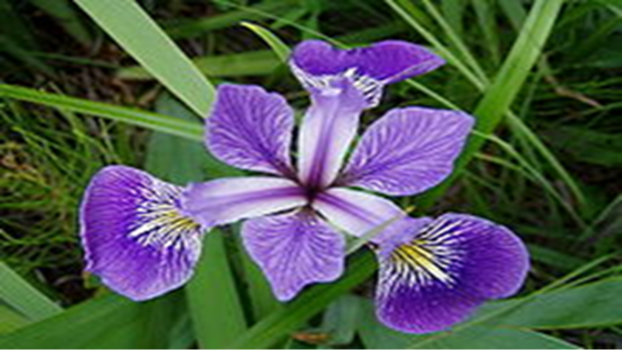
Figure 1.2: iris flower. Photo from Wikipedia.
If you are using Rstudio Cloud through a web browser, you are using a computer on the cloud, which cannot directly access your local files. Therefore you need to first upload the data file to the cloud using the Upload button in the Files tab in the lower right panel.
The data file can be imported into R by selecting Import Dataset in the File menu, and then choose “From Text(base)…”. As the default settings work well in this case, we just need to click Import in the pop-up window. That’s it! There is no need to spend half of a semester to learn how to import data, like some people used to complain when learning SAS. If you have trouble importing this data file, you can skip this step as this data set is included in R.
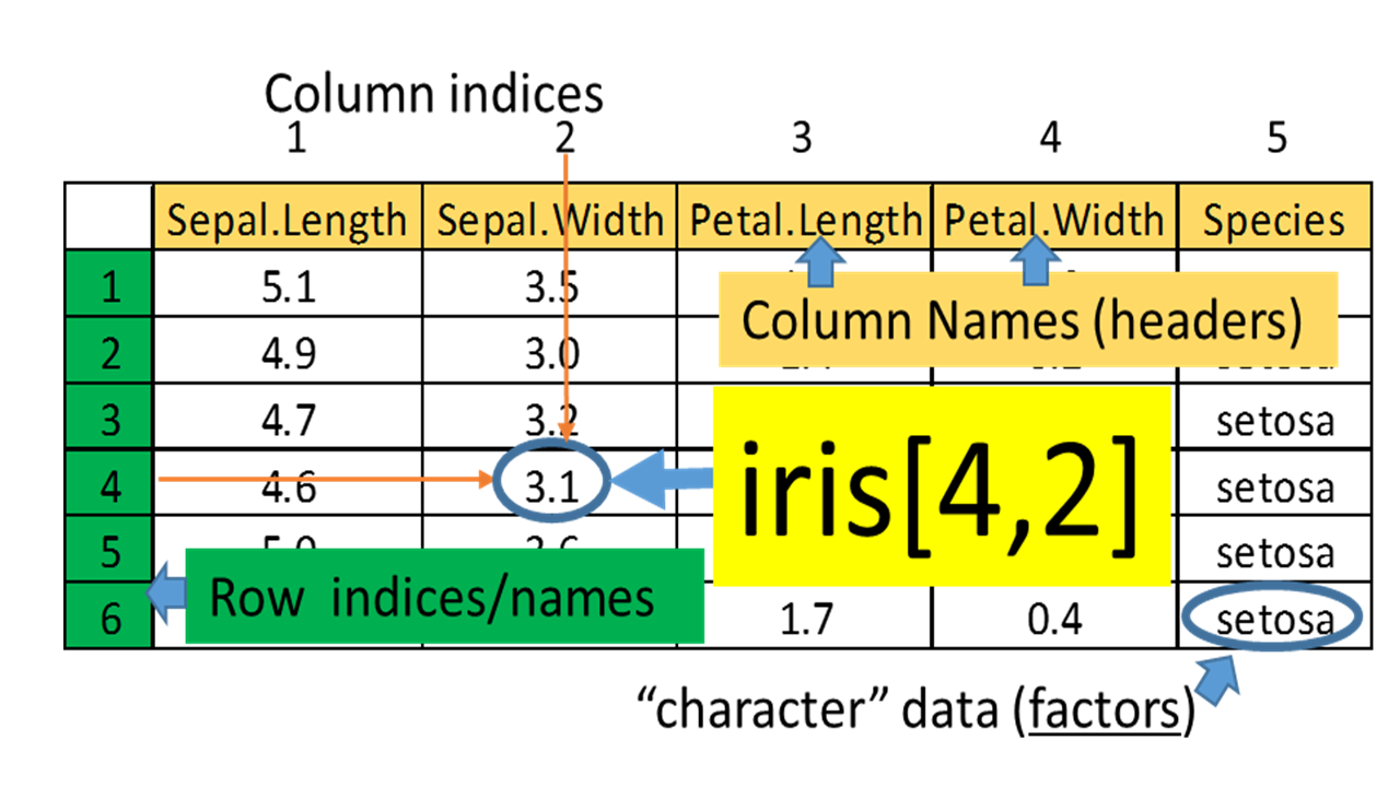
Figure 1.3: Example of a data frame.
To answer these questions, let us visualize and analyze the data with R. Type these commands without the comments marked by “#.”
View(iris) # show as a spreadsheethead(iris) # first few rows## Sepal.Length Sepal.Width Petal.Length Petal.Width Species
## 1 5.1 3.5 1.4 0.2 setosa
## 2 4.9 3.0 1.4 0.2 setosa
## 3 4.7 3.2 1.3 0.2 setosa
## 4 4.6 3.1 1.5 0.2 setosa
## 5 5.0 3.6 1.4 0.2 setosa
## 6 5.4 3.9 1.7 0.4 setosaclass(iris) # show the data type## [1] "data.frame"str(iris) # show the structure## 'data.frame': 150 obs. of 5 variables:
## $ Sepal.Length: num 5.1 4.9 4.7 4.6 5 5.4 4.6 5 4.4 4.9 ...
## $ Sepal.Width : num 3.5 3 3.2 3.1 3.6 3.9 3.4 3.4 2.9 3.1 ...
## $ Petal.Length: num 1.4 1.4 1.3 1.5 1.4 1.7 1.4 1.5 1.4 1.5 ...
## $ Petal.Width : num 0.2 0.2 0.2 0.2 0.2 0.4 0.3 0.2 0.2 0.1 ...
## $ Species : Factor w/ 3 levels "setosa","versicolor",..: 1 1 1 1 1 1 1 1 1 1 ...The imported data is stored in a data frame called iris, which contains
information of 5 variables for 150 observations (flowers). While the first 4 variables/columns,
Sepal.Length, Sepal.Width, Petal.Length, and Petal.Width, contain numeric values.
The 5th variable/column, Species, contains
characters indicating which sub-species a sample belongs to. This is an
important distinction, as they are treated differently in R.
Sometimes we need to overwrite data types guessed by R, which can be done during the data
importing process. If you are using the built-in iris data, the variable/column Species is a factor with three levels.
summary(iris) # summary statistics## Sepal.Length Sepal.Width Petal.Length Petal.Width
## Min. :4.300 Min. :2.000 Min. :1.000 Min. :0.100
## 1st Qu.:5.100 1st Qu.:2.800 1st Qu.:1.600 1st Qu.:0.300
## Median :5.800 Median :3.000 Median :4.350 Median :1.300
## Mean :5.843 Mean :3.057 Mean :3.758 Mean :1.199
## 3rd Qu.:6.400 3rd Qu.:3.300 3rd Qu.:5.100 3rd Qu.:1.800
## Max. :7.900 Max. :4.400 Max. :6.900 Max. :2.500
## Species
## setosa :50
## versicolor:50
## virginica :50
##
##
## The summary function provides us with information on the distribution of each variables. There are 50 observations for each of the three sub-species.
Individual values in a data frame can be accessed using row and column indices.
iris[3, 4] # returns the value lies at the intersection of row 3 and column 4
iris[3, ] # returns values of row 3
iris[, 4] # returns values of column 4
iris[3, 1:4] # returns values at the intersections of row 3 and columns from 1 to 4
To do the exercises, you need to create a blank Word document. Copy-and-paste the R code and corresponding outputs to the Word document, and then save it as a PDF file. Submit both the Word and PDF files to the Dropbox.
Exercise 1.1
Type data() in the R Console window. The pop-up window - R data sets - contain all built-in data sets in package datasets. Choose a data set whose structure is data frame, then answer the following questions:
- Display the first few rows of the data set. NOT all values in your data set.
- Show the dimension of the data set.
- Extract a subset which contains values in the 2nd through the 5th rows and the 1st through the 4th columns. If your data set contains fewer rows or columns, please choose another data set.
You can replace the iris data set with any of the built-in data sets as long as its data structure is data frame. Make sure you check the type of the data set by using class() or str() function. Note: You will need to change the variable names and ranges of rows and columns.
colnames(iris) # Column names## [1] "Sepal.Length" "Sepal.Width" "Petal.Length" "Petal.Width" "Species"Remember these column names, as we are going to use them in our analysis. Note that sepal length information is contained in the column named Sepal.Length. We can retrieve an entire column by using the data frame name followed by the column name. R is case-sensitive. “iris$petal.length” will not be recognized.
iris$Petal.Length # 150 petal lengthsIf this is too much typing, we can store the data in a new vector called PL.
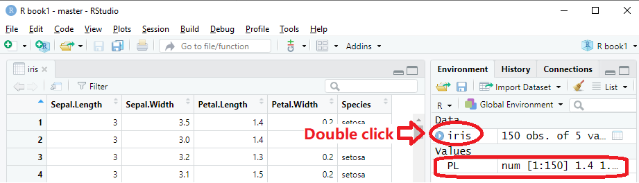
PL <- iris$Petal.Length # define a new variable which contains only the Petal.Length valuesSome might complain that nothing happens after you type in this command. Although nothing is printed out, you have created a new vector called PL in the memory. You can find it in the top right panel in the Environment tab. The process of programming is mostly creating and modifying data objects in the memory.
Like money saved in a bank, these data can be retrieved and used:
PL #print out 150 numbers stored in PL## [1] 1.4 1.4 1.3 1.5 1.4 1.7 1.4 1.5 1.4 1.5 1.5 1.6 1.4 1.1 1.2 1.5 1.3 1.4
## [19] 1.7 1.5 1.7 1.5 1.0 1.7 1.9 1.6 1.6 1.5 1.4 1.6 1.6 1.5 1.5 1.4 1.5 1.2
## [37] 1.3 1.4 1.3 1.5 1.3 1.3 1.3 1.6 1.9 1.4 1.6 1.4 1.5 1.4 4.7 4.5 4.9 4.0
## [55] 4.6 4.5 4.7 3.3 4.6 3.9 3.5 4.2 4.0 4.7 3.6 4.4 4.5 4.1 4.5 3.9 4.8 4.0
## [73] 4.9 4.7 4.3 4.4 4.8 5.0 4.5 3.5 3.8 3.7 3.9 5.1 4.5 4.5 4.7 4.4 4.1 4.0
## [91] 4.4 4.6 4.0 3.3 4.2 4.2 4.2 4.3 3.0 4.1 6.0 5.1 5.9 5.6 5.8 6.6 4.5 6.3
## [109] 5.8 6.1 5.1 5.3 5.5 5.0 5.1 5.3 5.5 6.7 6.9 5.0 5.7 4.9 6.7 4.9 5.7 6.0
## [127] 4.8 4.9 5.6 5.8 6.1 6.4 5.6 5.1 5.6 6.1 5.6 5.5 4.8 5.4 5.6 5.1 5.1 5.9
## [145] 5.7 5.2 5.0 5.2 5.4 5.1mean(PL) #mean, duh## [1] 3.758Exercise 1.2
- Compute the mean of the sepal length in the data set iris.
- Compute the mean of speed in the built-in data set cars.
The best way to find and learn R functions is Google search. The R community is uniquely supportive. There are many example codes and answers to even the dumbest questions on sites like StackOverflow.com.
Exercise 1.3
- Google “R square root function” to find the R code, then compute the value of \(\sqrt{56.7}\).
- Use R to find the maximal value of the variable mpg in the data set mtcars.
1.4 Analyzing one set of numbers
A vector holds a series of numbers or characters. Using various functions, R made it very easy to do the same calculations (add, subtract, multiply,…) on all of them at once or collectively.
summary(PL)## Min. 1st Qu. Median Mean 3rd Qu. Max.
## 1.000 1.600 4.350 3.758 5.100 6.900This produces a lot of useful information about the distribution of petal length:
The minimum is 1.000, and the maximum is 6.900.
Average petal length is 3.758.
The mid-point, or median, is 4.350, as about half of the numbers are smaller than 4.350. Why the median is different from the mean? What happens if there is a typo and one number is entered 340cm instead of 3.40cm?
The 3rd quartile, or 75th percentile, is 5.100, as 75% of the flowers have petals shorter than 5.100. If a student’s GPA ranks 5th in a class of 25, he/she is at 80th percentile. The minimum is the 0th percentile and the maximum is the 100th percentile.
The 1st quartile, or 25th percentile, is 1.600. Only 25% of the flowers have petals shorter than 1.600. These summary statistics are graphically represented as a boxplot in the Figure 1.4A. Boxplots are more useful when multiple sets of numbers are compared.
boxplot(PL) # boxplot of Petal Length.
boxplot(iris[, 1:4]) # boxplots of four columns of iris.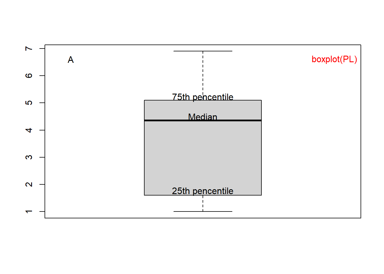
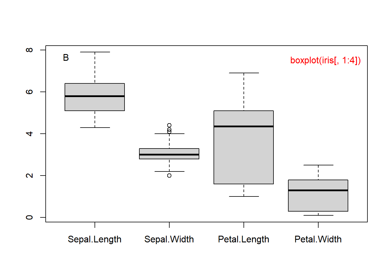
Figure 1.4: Boxplot of petal length (A) and of all 4 columns (B).
In RStudio, you can copy a plot to the clipboard using the Export button on top of the plot area. Or you can click zoom, right click on the pop-up plot and select “Copy Image”. Then you can paste the plot into Word.
Exercise 1.4
- Check the data structure of the built-in data set mtcars.
- Get the boxplot of Mile Per Gallon (mpg) in the data set mtcars.
To quantify the variance, we can compute the standard deviation σ: \[\begin{align} σ=\sqrt{\frac{1}{N-1}[(x_{1}-\bar x)^2+(x_{2}-\bar x)^2+...+(x_{N}-\bar x)^2]} \end{align}\] where N is the sample size and \[\begin{align} \bar x=\frac{1}{N}(x_{1}+x_{2}+\cdots+x_{N}) \end{align}\] If all the measurements are close to the mean µ, then standard deviation should be small.
sd(PL) # standard deviation of Petal Length## [1] 1.765298SW <- iris$Sepal.Width
sd(SW) # standard deviation of Sepal Width## [1] 0.4358663As we can see, these flowers have similar sepal width, but they differ widely in petal length. This is consistent with the boxplot above. Perhaps changes in petal length lead to better survival in different habitats.
With R, it is easy to generate graphs.
barplot(PL) # bar plot of Petal Length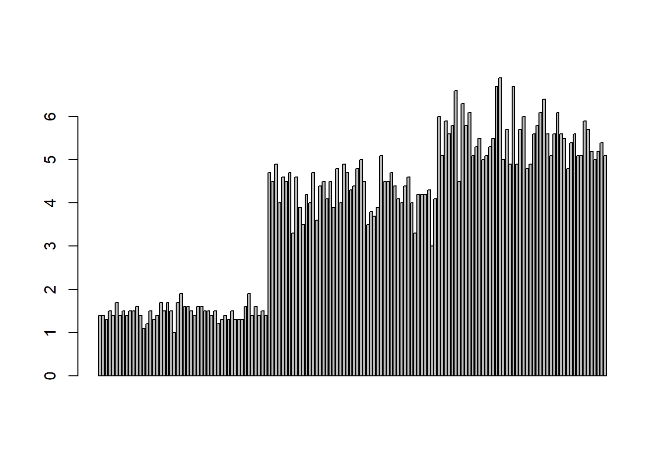
Figure 1.5: Barplot of petal length.
This figure suggests that the first 50 flowers (iris setosa) have much shorter petals than the other two species. The last 50 flowers (iris virginica) have slightly longer petals than those of iris versicolor.
plot(PL) # Run scatter plot
hist(PL) # histogram
lag.plot(PL) # lag plot
qqnorm(PL) # Q-Q plot for normal distribution
qqline(PL) # add the regression line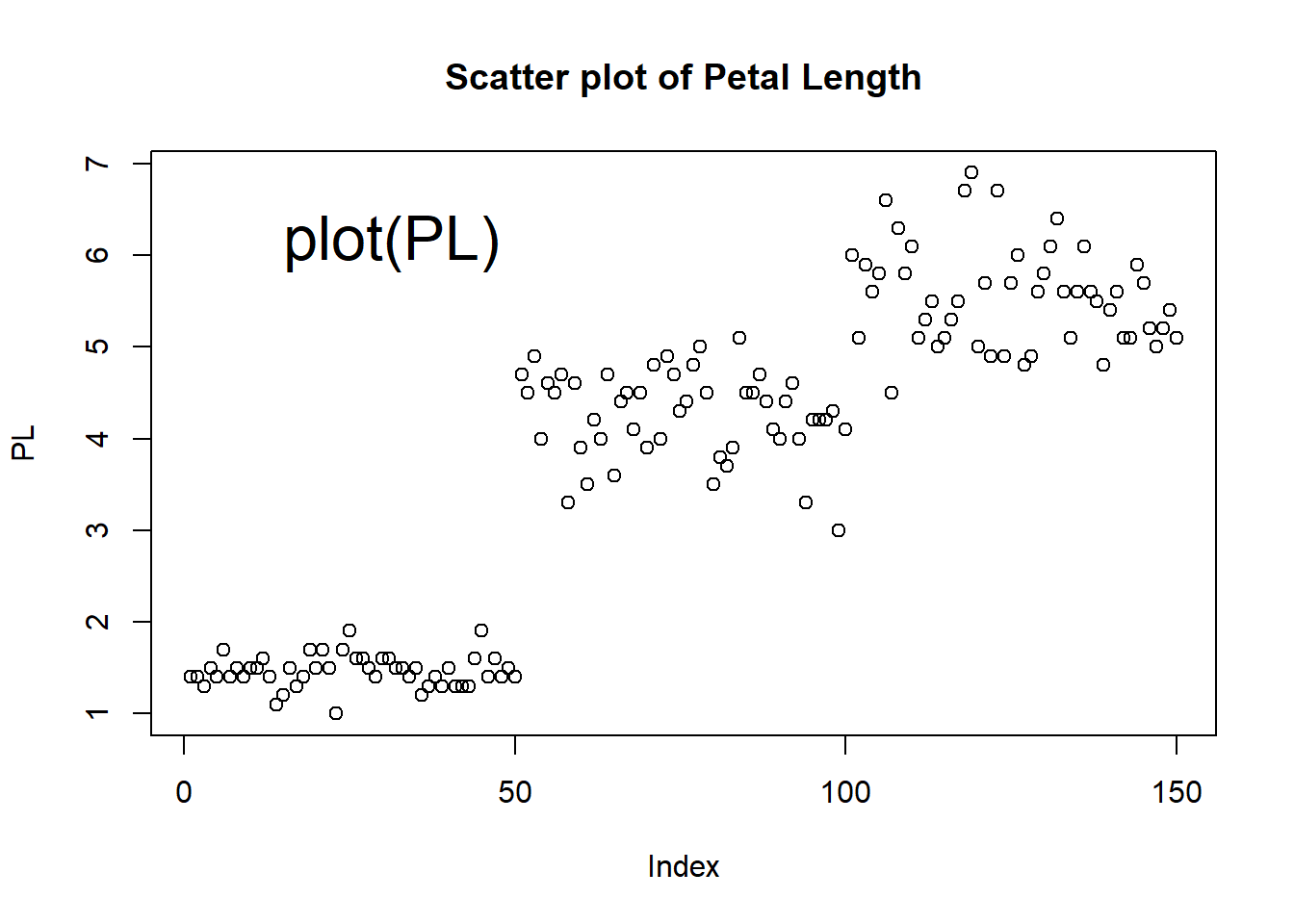
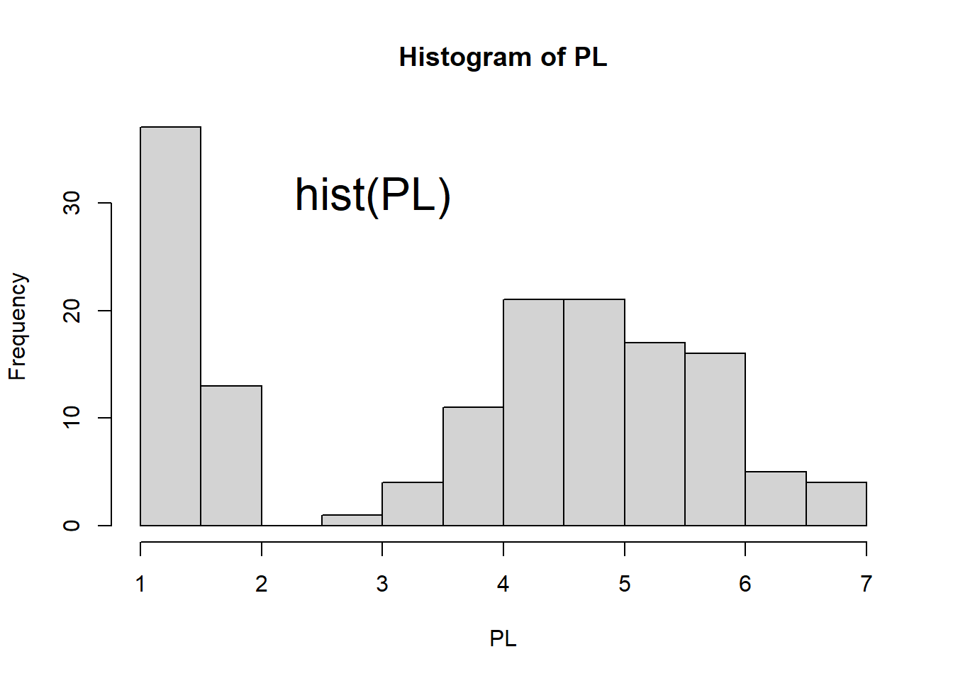
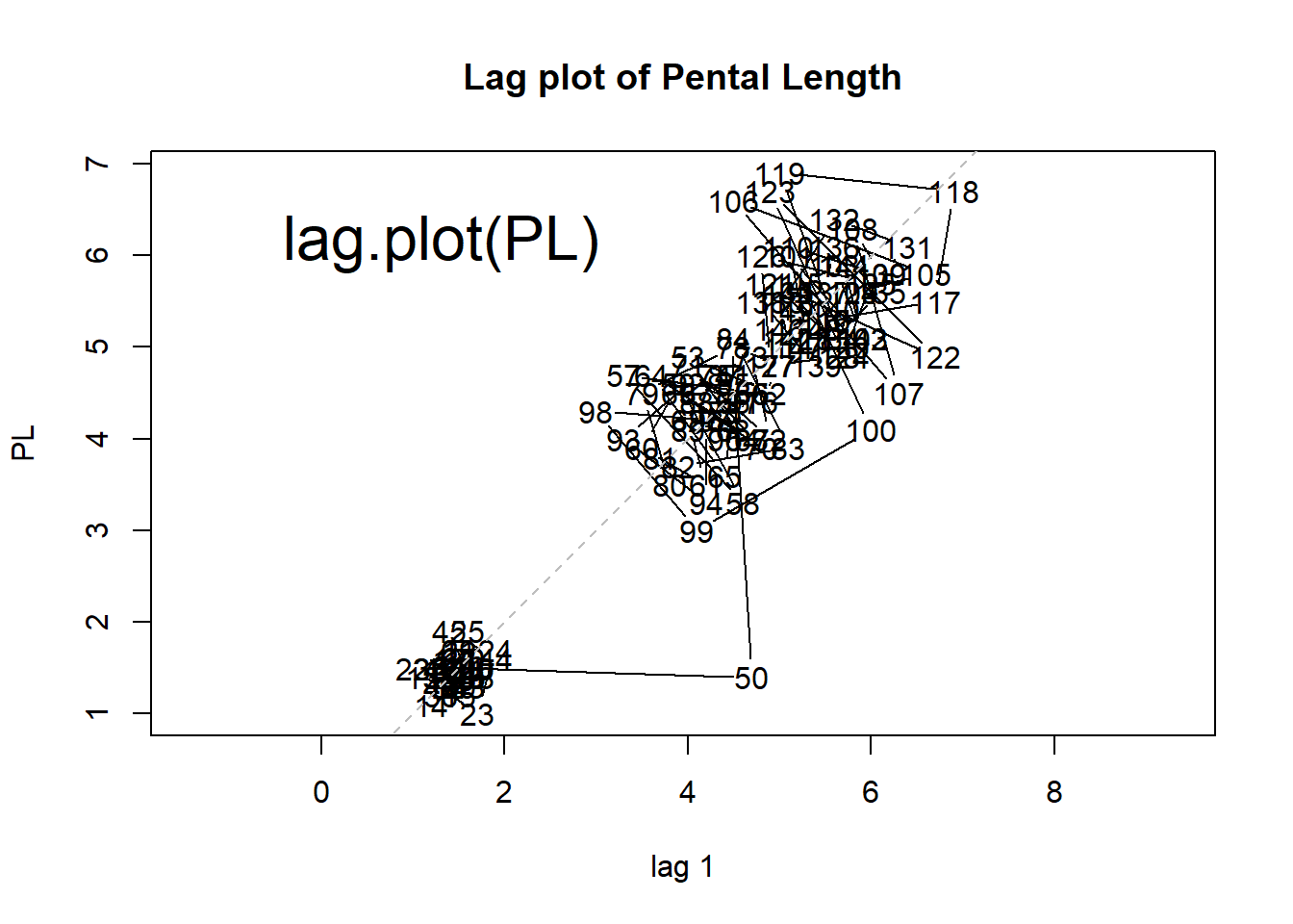
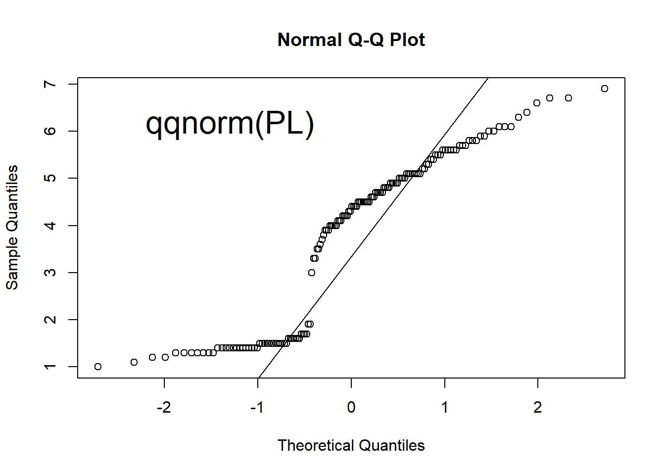
Figure 1.6: Scatter plot, histogram, lag plot and normal Q-Q plot.
There are three different groups in the scatter plot. The petal length of one group is much smaller than the other two groups.
Histogram shows the distribution of data by plotting the frequency of data in bins. The histogram top right of Figure 1.6 shows that there are more flowers with Petal Length between 1 cm and 1.5 cm. It also shows that the data does not show a bell-curved distribution.
The lag plot is a scatter plot against the same set of number with an offset of 1. Any structure in a lag plot indicates non-randomness in the order in which the data is presented. We can clearly see three clusters, indicating that values are centered around three levels sequentially.
Q-Q (quantile-quantile) plots can help check if data follows a Normal distribution, which is widely observed in many situations. It is the pre-requisite for many statistical methods. See Figure 1.7 for an example of normal distribution. Quantiles of the data is compared against those in a normal distribution. If the data points on a Q-Q plot form a straight line, the data has a normal distribution.
Exercise 1.5
- Run x = rnorm(500) to generate 500 random numbers following the Standard Normal distribution
- Generate scatter plot, histogram, lag plot, and Q-Q plot. Your plots should like those in Figure 1.7.
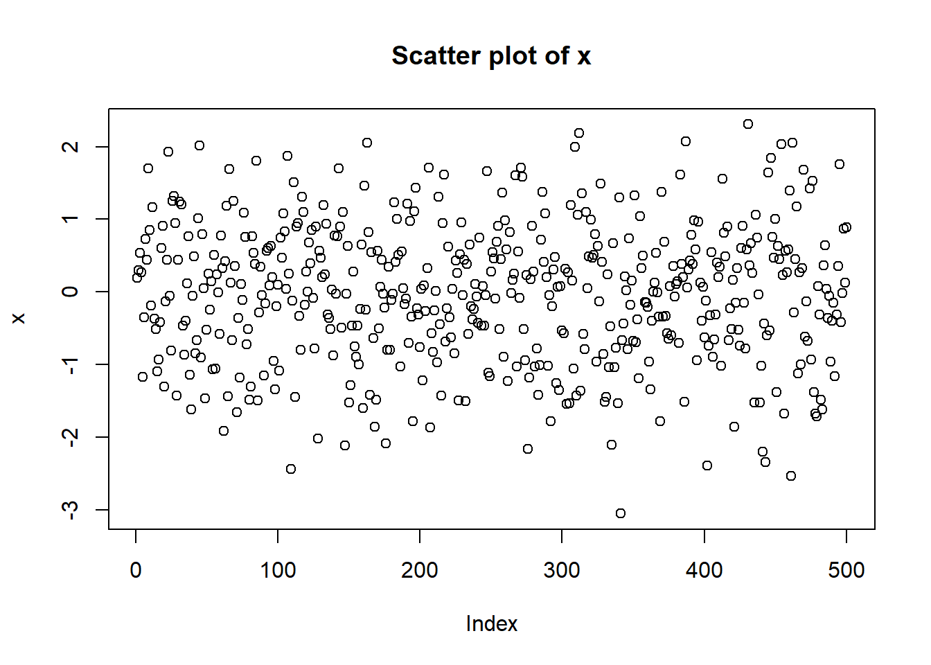
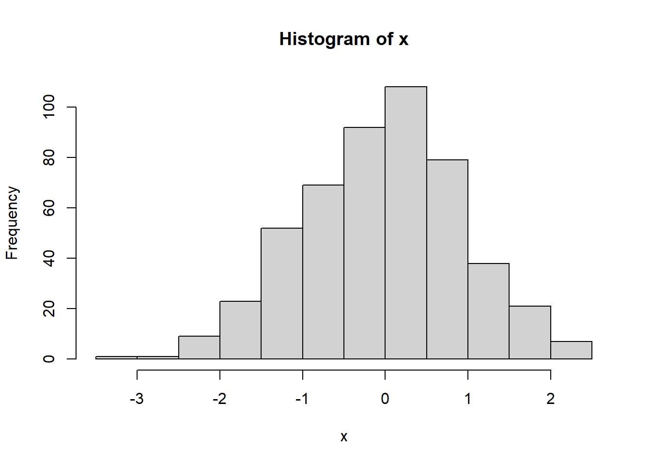
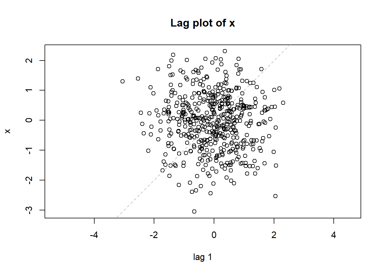
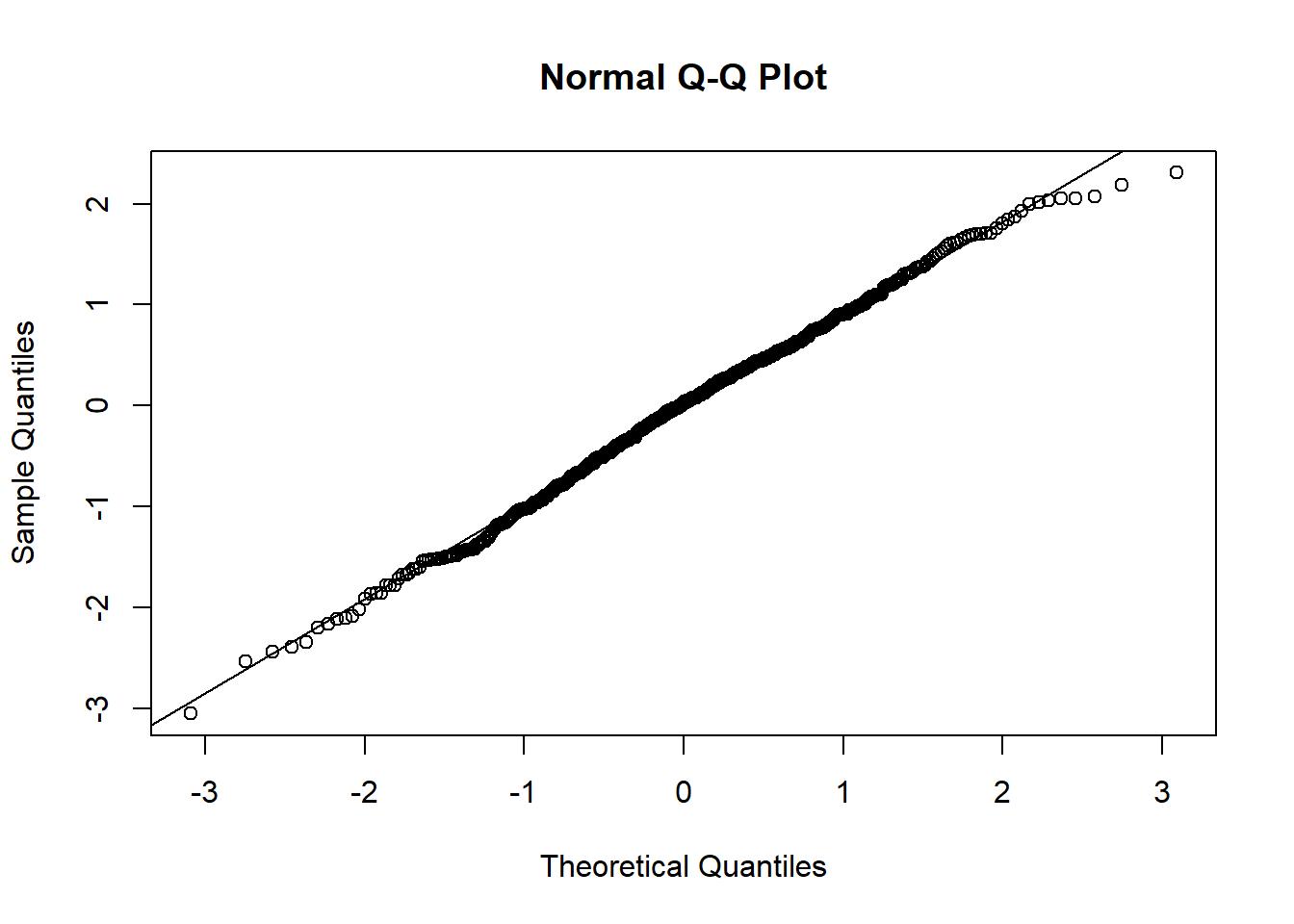
Figure 1.7: Plots for randomly generated numbers following a normal distribution.
Exercise 1.6
Generate scatter plot, histogram, lag plot, and Q-Q plot for the Septal Length in the iris dataset.
We can do a one-sample t-test for the mean of a normally distributed data. Suppose the pental length of the species setosa, the first 50 observations of PL, follows a normal distribution. We want to test if its mean is different from 1.5 cm at the significance level \(\alpha = 0.05\). Below is the code for the testing.
t.test(PL[1:50], mu = 1.5) # two sided t-test for the mean of petal length of setosa##
## One Sample t-test
##
## data: PL[1:50]
## t = -1.5472, df = 49, p-value = 0.1282
## alternative hypothesis: true mean is not equal to 1.5
## 95 percent confidence interval:
## 1.412645 1.511355
## sample estimates:
## mean of x
## 1.462In this case, our null hypothesis is that the mean of petal length of setosa is 1.5 cm. Since p-value 0.1282 is greater than the significance level 0.05, there is no strong evidence to reject the null hypothesis. This function also tells us the 95% confidence interval for the mean. Based on our sample of the 50 observations, we have 95% confidence to conclude that the mean of petal length of setosa (if we were to measure all setosa in the world) is between 1.412645 cm and 1.511355 cm.
Exercise 1.7
Compute 95% confidence interval of sepal length of setosa.
We can perform a hypothesis test on whether a set of numbers are derived from normal distribution. When interpreting results from hypothesis testing, it is important to state the null hypothesis is. Here the null hypothesis is that the data is from a normal distribution.
# normality test
shapiro.test(PL)
##
## Shapiro-Wilk normality test
##
## data: PL
## W = 0.87627, p-value = 7.412e-10If petal length is normally distributed, there is only 7.412×10⁻¹⁰ chance of getting the observed test statistic of 0.87627. In other words, it is highly unlikely that petal length follows a normal distribution. We reject the normal distribution hypothesis, which could be corroborated by our plots above.
# normality test of  the first 50 observations of PL
shapiro.test(PL[1:50])
##
## Shapiro-Wilk normality test
##
## data: PL[1:50]
## W = 0.95498, p-value = 0.05481Given the significance level \(\alpha=0.05\), the p-value of normality test for the pental length of setosa is 0.05481 which is greater than 0.05. Then we fail to reject the null hypothesis and conclude that we don’t have evidence to reject the hypthoses that the pental length of setosa follows a normal distribution. In statistics, we rely on both charts and statistical models to draw a conclusion.
Exercise 1.8
- Run Shapiro’s test on sepal width. Does it follow a normal distribution given the significant level \(\alpha = 0.05\)?
- Generate histogram and Q-Q plot for sepal width. Do the plots show a Normal approximation?
1.5 Analyzing a categorical variable
In the iris dataset, the last column contains the species information. We call this a categorical variable. Bar and Pie charts are very effective in showing proportions. We can see that the three species are each represented with 50 observations.
counts <- table(iris$Species) # tabulate the frequencies
counts
##
## setosa versicolor virginica
## 50 50 50pie(counts) # pie chart
barplot(counts) # bar plot
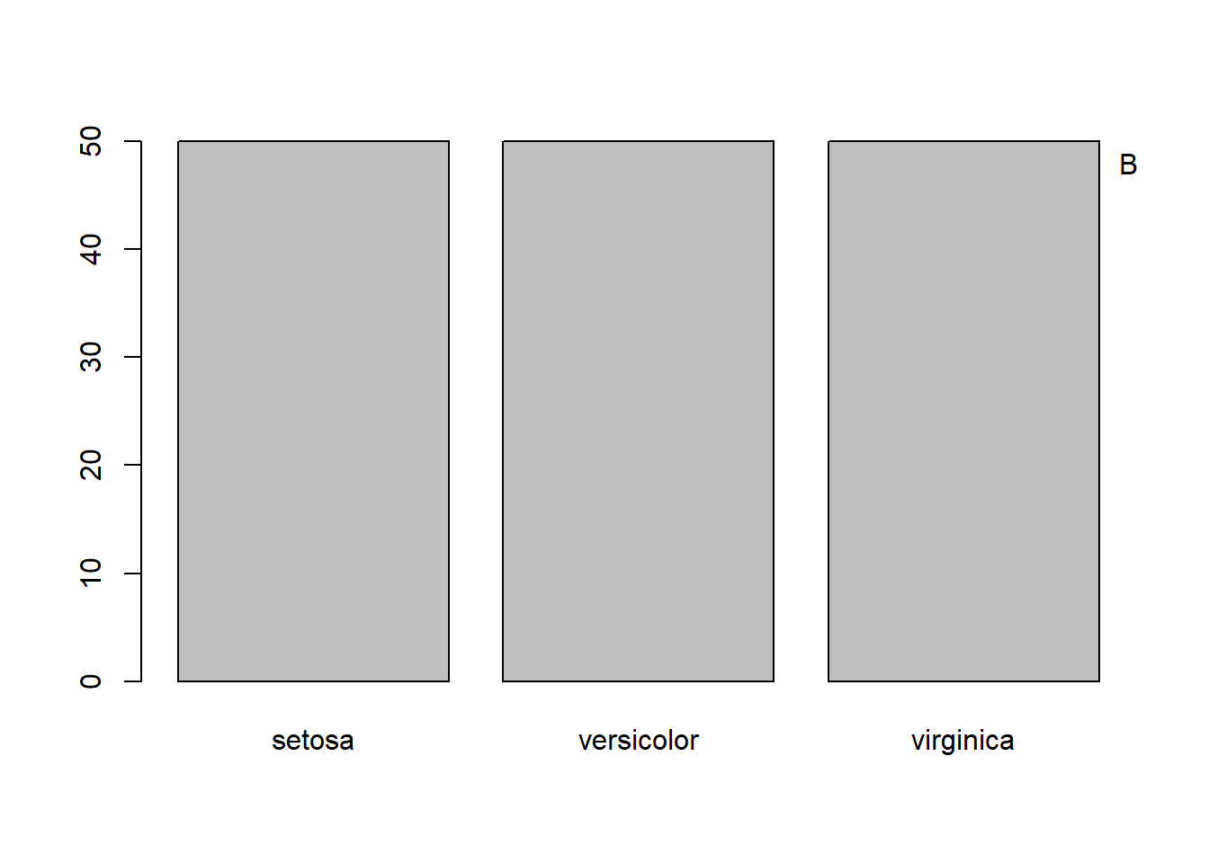
Figure 1.8: Frequencies of categorical values visualized by Pie chart (A) and bar chart (B).
1.6 The relationship between two numerical variables
Scatter plot is very effective in visualizing the correlation between two columns of numbers.
PW <- iris$Petal.Width # just lazy
plot(PW, PL) # scatterplot of pental width vs pental length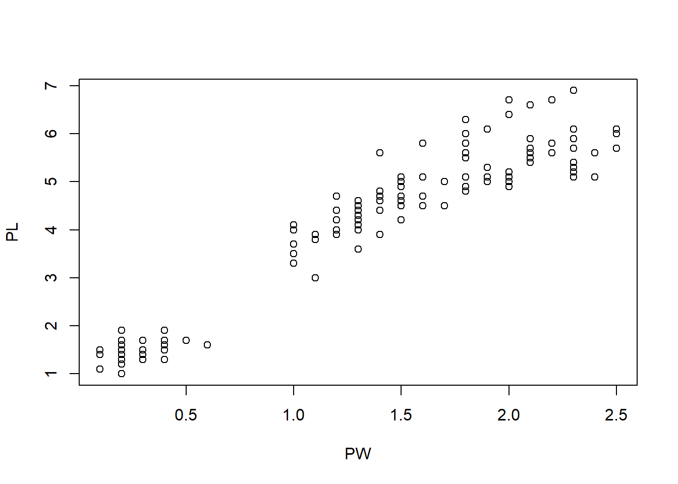
Figure 1.9: Scatter plot of petal width and petal length.
Figure 1.9 shows that there is a positive correlation between petal length and petal width. In other words, flowers with longer petals are often wider. So the petals are getting bigger substantially when both dimensions increase.
Another unusual feature is that there seem to be two clusters of points. Do the points in the small cluster represent one particular species of iris? We need to further investigate this. The following will produce a plot with the species information color-coded. The resultant Figure 1.10 clearly shows that indeed one particular species, setosa constitutes the smaller cluster in the low left. The other two species also show a difference in this plot, even though they are not easily separated. This is a very important insight into this dataset.
SP <- as.factor(iris$Species)
plot(PW, PL, col = SP) # change colors based on Species
legend("topleft", levels(SP), fill = 1:3) # add legends on topleft.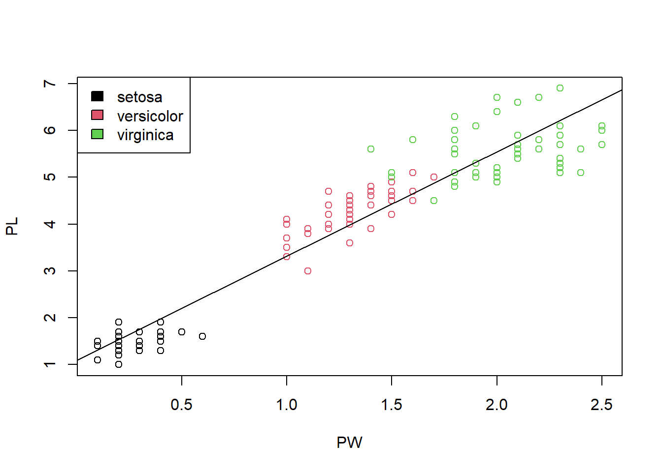
Figure 1.10: Scatter plot shows the correlation of petal width and petal length.
To change the color for a specific data point, we defined a new variable SP by converting the last column into a factor. The function str(SP) shows that the SP is a factor with 3 levels which are internally coded as 1, 2, and 3. This enables us to use these as color codes. This kind of base plotting has been simplified by modern systems such as ggplot2, which we will discuss later. So you do not have to remember any of this.
str(SP) # show the structure of Species.## Factor w/ 3 levels "setosa","versicolor",..: 1 1 1 1 1 1 1 1 1 1 ...Perhaps due to adaption to the environment, change in petal length leads to better survival. With the smallest petals, setosa is found in Arctic regions. versicolor is often found in the Eastern United States and Eastern Canada. virginica “is common along the coastal plain from Florida to Georgia in the Southeastern United States–Wikipedia.” It appears the iris flowers in warmer places are much larger than those in colder ones. With R, it is very easy to generate lots of graphics. But we still have to do the thinking. It requires us to interpret the charts in the context.
Exercise 1.9
The mtcars data description can be found here: https://stat.ethz.ch/R-manual/R-patched/RHOME/library/datasets/html/mtcars.html.
Based on mtcars data set, plot a scatter plot which shows the correlation between Miles/(US) gallon and Displacement (cu.in.). In this data set, the type of cyl is numeric. You will need to use function newcyl -> as.factor(cyl) to transfer the type to factor. Then replace all mtcars$cyl with newcyl.
- Color the scatter plot by Number of cylinders;
- Add legend to the top right.
We can quantitatively characterize the strength of the correlation using several types of correlation coefficients, such as Pearson’s correlation coefficient. It ranges from -1 to 1. Zero means no linear correlation.
cor(PW, PL)## [1] 0.9628654This means the petal width and petal length are strongly and positively correlated. we can add this information to the plot as text:
text(1.5, 1.5, paste("R=0.96"))cor.test(PW, PL)##
## Pearson's product-moment correlation
##
## data: PW and PL
## t = 43.387, df = 148, p-value < 2.2e-16
## alternative hypothesis: true correlation is not equal to 0
## 95 percent confidence interval:
## 0.9490525 0.9729853
## sample estimates:
## cor
## 0.9628654Through hypothesis testing, we reject the null hypothesis that the true correlation is zero (no correlation). That means the correlation is statistically significant. Note that Pearson’s correlation coefficient is not robust against outliers and other methods such as Spearman’s exists. See help info:
?cor # show help info on the function of cor()We can also determine the equation that links petal length and petal width. This is so called regression analysis. We assume
\(Petal.Length = \alpha × Petal.Width + c + \epsilon\),
where \(\alpha\) is the slope parameter, \(c\) is a constant, and \(\epsilon\) is some random error. This linear model can be determined by a method that minimizes the least squared-error:
model <- lm(PL ~ PW) # Linear Model (lm)
summary(model) # shows the details
##
## Call:
## lm(formula = PL ~ PW)
##
## Residuals:
## Min 1Q Median 3Q Max
## -1.33542 -0.30347 -0.02955 0.25776 1.39453
##
## Coefficients:
## Estimate Std. Error t value Pr(>|t|)
## (Intercept) 1.08356 0.07297 14.85 <2e-16 ***
## PW 2.22994 0.05140 43.39 <2e-16 ***
## ---
## Signif. codes: 0 '***' 0.001 '**' 0.01 '*' 0.05 '.' 0.1 ' ' 1
##
## Residual standard error: 0.4782 on 148 degrees of freedom
## Multiple R-squared: 0.9271, Adjusted R-squared: 0.9266
## F-statistic: 1882 on 1 and 148 DF, p-value: < 2.2e-16Note that in the regression model, the tilde(~) links a response variable on the left with one or more independent variables on the right side. It is a shortcut for an operator. We are defining a statistical model where the PL is modeled as a function of PW. In addition to regression models, we also use formula in plots.
As we can see, we estimated that \(\alpha=2.22944\) and \(c=1.08356\). Both parameters are significantly different from zero as the p-values are <2×10-16 in both cases. In other words, we can reliably predict
\(Petal.Length = 2.22944 × Petal.Width + 1.08356\).
This model can be put on the scatter plot as a line.
abline(model) # add regression line to plot.And we can get the diagnostic plots for regression analysis:
plot(model) # diagnostic plots for regressionSometimes, we use this type of regression analysis to investigate whether variables are significantly associated.
Exercise 1.10
Investigate the relationship between sepal length and sepal width using scatter plots, correlation coefficients, test of correlation, and linear regression. Again interpret all your results in PLAIN and proper English.
1.7 Testing the differences between two groups
Are boys taller than girls of the same age? Such situations are common. We have measurements of a random sample from a population. From the sample we want to know if the observed differences among the two groups reflect real differences in the population or due to random sampling error.
Species <- iris$Species
# Comparing distributions of petal length of the three species by boxplot
boxplot(PL ~ Species)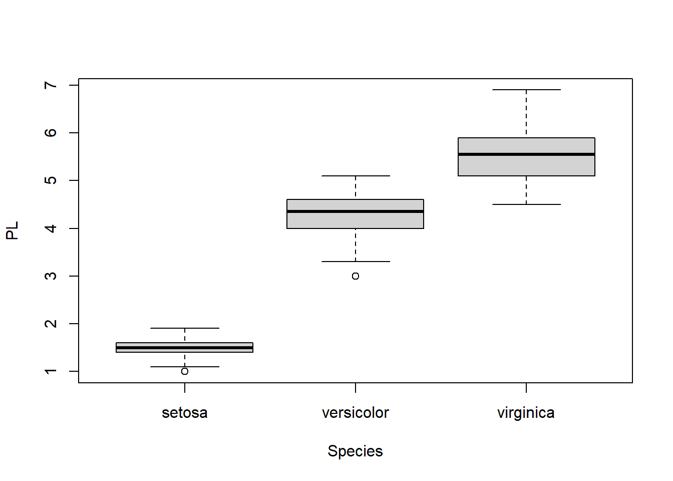
Figure 1.11: Boxplot of petal length, grouped by species.
Here, R automatically split the dataset into three groups according to Species and created a boxplot for each.
From the boxplot, it is obvious that Setosa has much shorter petals. Are there differences between versicolor and virginica significant? We only had a small sample of 50 flowers for each species. But we want to draw some conclusion about the two species in general. We could measure all the iris flowers across the world; Or we could use statistics to make inference. Let’s extract corresponding data.
PL1 <- PL[51:100] # extract Petal Length of versicolor
PL1 # a vector with 50 numbers
PL2 <- PL[101:150] # extract Petal length of virginica
PL2 # y contain 50 measurementsboxplot(PL1, PL2) # a boxplot of the two groups of values
t.test(PL1, PL2) # two sample t-test##
## Welch Two Sample t-test
##
## data: PL1 and PL2
## t = -12.604, df = 95.57, p-value < 2.2e-16
## alternative hypothesis: true difference in means is not equal to 0
## 95 percent confidence interval:
## -1.49549 -1.08851
## sample estimates:
## mean of x mean of y
## 4.260 5.552In this two sample t-test, our null hypothesis is that the mean of petal length for versicolor is the same as virginica. A small p-value of 2.2x10⁻¹⁶ indicates under this hypothesis, it is extremely unlikely to observe the difference of 1.292cm through random sampling. Hence we reject that hypothesis and conclude that the means for the two species are significantly different. If we measure all versicolor and virginica flowers in the world and compute their average petal lengths, it is very likely that the two averages are different. On the other hand, if the p-value is larger than a given significance level, let’s say \(\alpha = 0.05\), we fail to reject the null hypothesis and conclude that we don’t have strong evidence to reject the means are same.
We actually do not need to separate two set of numbers into two data objects in order to do a t-test. We can do it right within the data frame. R can separate data points by columns.
# Extract observations of versicolor which are lined at rows from 51 to 150
df <- iris[51:150, ]
t.test(Petal.Length ~ Species, data = df) # t-test
boxplot(Petal.Length ~ Species, data = droplevels(df)) # removes empty levels in Species
Exercise 1.11
Use boxplot and t-test to investigate whether the means of sepal width between versicolor and virginica are different. Interpret your results.
1.8 Testing the difference among multiple groups (ANOVA)
As indicated by Figure 1.12, sepal width has small variation across species. We want to know if the means of sepal width for the 3 species are same or not. This can be done through Analysis of Variance (ANOVA).
SW <- iris$Sepal.Width
boxplot(SW ~ SP)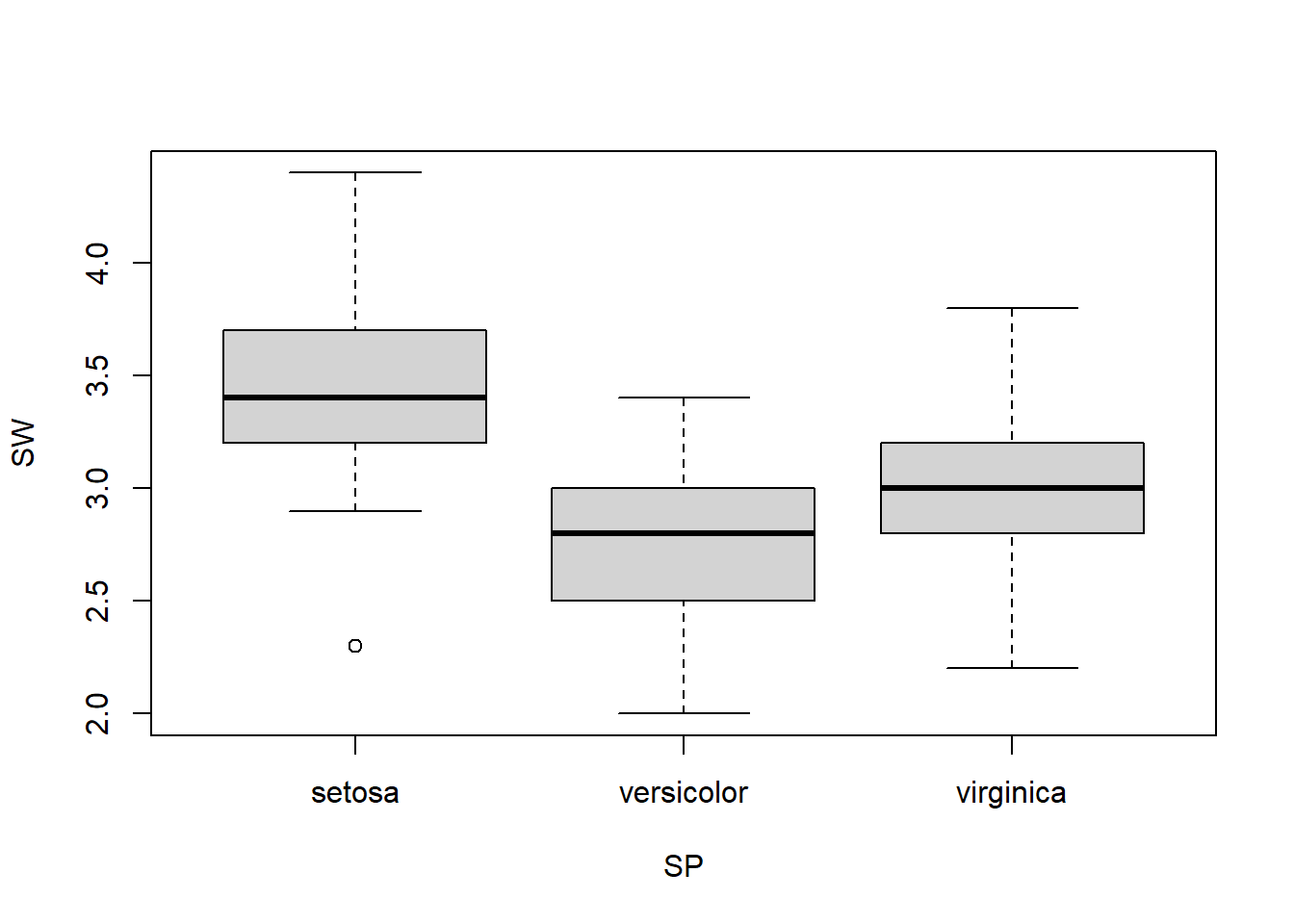
Figure 1.12: Boxplot of sepal width across 3 species.
summary(aov(SW ~ SP))## Df Sum Sq Mean Sq F value Pr(>F)
## SP 2 11.35 5.672 49.16 <2e-16 ***
## Residuals 147 16.96 0.115
## ---
## Signif. codes: 0 '***' 0.001 '**' 0.01 '*' 0.05 '.' 0.1 ' ' 1Since p-value is much smaller than 0.05, we reject the null hypothesis. We can conclude that not all the 3 species have the same mean of sepal width. In other words, there are at least two of the species have different means of sepal width. This is the only thing we can conclude from this, since this is how the hypothesis was set up. The boxplot in Figure 1.12 seems to indicate that setosa has wider sepals.
Exercise 1.12
Use boxplot and ANOVA to investigate whether the means of spetal width are the same for the 3 species.
I hope this give you some idea about what it is like to use R to visualize and analyze data. It is interactive and graphical. If I made you feel it is complicated, I failed as a instructor. Most people can learn R themselves by working on a small dataseet of their interest. Just Google everything and keep trying.

From Tenor.com